Friday, September 28, 2007

YES!


The printer problem I’ve been having appears to finally have been solved. Yesterday I received the package of Pictorico transparency I ordered.

Pictorico is quite a bit more expensive than the brand of transparency film I had been using, but it’s considered one of the best. After figuring out that the banding was likely caused by the film I was using getting old, I decided to try the good stuff.
I printed a negative, using the Pictorico transparency, of the same image I’ve been having problems with, and it looked beautiful. Not only was there no banding present at all, but the image was much more sharp than on the other brand of transparency I was using. It also dried much more quickly. I tried touching it about 10 minutes after it came out of the printer, and it felt dry. WIth the old transparency film, I didn’t dare touch it for several hours, or the ink would smear.

The real test came last night, when I made a cyanotype print from the new negative. As you can see, it looks great. I’m really happy with it. The print is very clear and sharp, and adjusting the transfer curves has given it a much fuller tonal range than usual with a cyanotype.

I printed two more negatives last night, and made cyanotype prints with them today. They are every bit as sharp as the first one, and also have the full tonal range.

So, after about three weeks of stress and countless dead ends, It looks like I’ll finally be able to get to work making prints.

Wednesday, September 26, 2007

A Quick Update

Just a quick update to the problem I'm having with banding. I e-mailed Dan Burkholder, who is a digital negative expert. He's written a book widely considered one of the best on the subject.

He had some good advice. The things that seemed most relevant to my situation were that the cheap transparency film I've been using could have aged poorly and the coating that holds the ink dried out, and that something could actually be wrong with the printer. To test both of these ideas, I took his suggestions and tried two things.

First, I cut a piece of the transparency film so that it could be fed into the printer rotated 90 degrees. By doing this, I could see if the transparency had dried in bands. When I made a print, there was still banding, but it didn't seem as pronounced as when the film is fed through the printer the usual way.

That didn't completely rule out a problem with the printer, so today I tried Dan Burkholder's other piece of advice, which was to find someone else with the same printer, and print the same file using the same transparency film in it. As luck would have it, the school I teach at has the same model printer in the Mac classroom. So, I went to school today (which was fun-I got to talk to lots of my colleagues whom I don’t see regularly due to my being on sabbatical) and made a print. If banding showed up on that one, then the likely cause of the problem would be the transparency film, and not my printer.

Looking at the print I made at school, I saw...banding! Nearly identical banding to what I’m getting at home, in fact. That means, the likely culprit is the transparency film, not the printer. I’m relieved, visions of having to buy a new printer have been dancing in my head the past couple of weeks.

So, now I have some much more expensive, but much higher quality transparency film being delivered tomorrow. When It arrives, I’ll try printing a negative and see what happens.

Tuesday, September 25, 2007

Problem not solved...

I thought the problems I’ve been having with printing transparencies was about over. A sample print came out fine, and after making one final adjustment to a transfer curve, I was all ready to finally start printing transparencies.

Well, I was wrong. Even though my sample print did not show banding, my 13 X 19 transparency did. Ever frustrated, I spent several hours online doing research. Based on what learned, I cleaned the print pads, and tried a different paper path. I still got banding. Maybe slightly narrower bands, but they are still there.

As a test, I tried a 13 X 19 full-color print on archival inkjet paper. It came out beautifully. It’s only 13 X 19 transparencies that show banding. I was about to take my printer in to be serviced, but I doubt that they’ll find anything wrong with it.

So now I’m stuck. I’ve got two things to try. One is ordering some expensive inkjet transparency film. It’s a brand that I see mentioned often on the photo tech forums I’ve been visiting. If it works, great. If not, I’m out even more money and am no farther ahead.

I’m also going to try reworking one of my images a little. One thing I was reading online suggested that very smooth areas like photos of skies are more likely to not reproduce as well on transparency film. Banding wasn’t explicitly mentioned, but it’s worth trying. The image I’ve been having trouble with has a large patch of clear sky in it. I’m going to add some visual noise to the sky area to see if it hides the banding. I don’t have high hopes of this working. Several days ago I printed a negative that didn’t have large smooth areas, and still saw banding in the resulting print. But at this point, I’m willing to try anything.

Sunday, September 23, 2007

Problem Solved?

Well, it’s been a frustrating and very stressful week, but I think I have my printing and calibration problems nearly solved.
If you read my last post, you’ll know that I’ve been working on printing digital negatives on transparency film. After several false starts and other problems, I got the transfer curves right, but was getting banding in the 13 X 19 transparencies made with my printer.
Here’s how the banding shows up in a cyanotype print. This should be a continuous tone area, the stripes you see are the result of banding in the transparency.


The banding in the transparencies looked like it was occurring with the color inks (not the blacks), so I switched to true grayscale for printing (no color inks). This meant that I had to do the transfer curve calibrations over again, which meant three more versions of the test negative and print you saw in the last post.
I got a good looking sample print, but the 13 X 19 negative I made still showed banding.

So, I tried aligning the print heads, first automatically, then manually. I cleaned the print heads several times, changed several ink tanks ( I used several tanks of ink while figuring this all out), and still, banding in the transparency prints. At this point, I started getting really stressed out. I was running through lots of expensive materials, and kept ending up at the same spot. I was also stuck, and could not progress in my work, for what was going on three weeks. I called Epson tech support, but that was a waste of time. They told me that maybe my blank transparencies were dusty, and other useless suggestions that indicated they had no idea what the problem might be.

All this time, 8 1/2 X 11 transparencies were coming out mostly ok. It was the 13 X 19 ones that were banding. That suggested to me that the problem might be the way the large transparency sheets were feeding through the printer.

The Epson printer driver has no setting for transparencies. You have to guess what to set the driver at when printing them. The Epson tech support guy told me that Epson does not support any media that's not made by them. They don’t manufacture 13 X 19 transparency, could not recommend another brand, and had no advice on how to set the print driver. Figuring I had to try something, I decided I had to make test prints using every paper setting available.

I didn’t want to blow through another ten or more sheets of 13 X 19 transparency, so I selected several 2 X 13 swatches of an image and printed them on the same sheet of transparency film while varying paper settings in the print driver. For each new setting, I ran the same piece of transparency through the printer. It only took a few tries before I found a setting that resulted in minimal banding. There’s still a tiny bit of banding, but not enough to show up too much in a cyanotype print, as you can see here.


Because this is a different paper setting than I used before, I have to go through the transfer curve calibration a third time. I’m getting to be an old hand at it now, so it shouldn’t take too long. Once I get the correct curve, I’ll try printing a 13 X 19 negative. I’m optimistic that this will work, but I’m also not getting my hopes up, just in case.

I tried not to let the talk get too technical here. If anyone is trying something similar, I’m happy to offer more detailed advice. Send me an e-mail or leave a comment, and I'll help if I can.

Saturday, September 15, 2007

Making Digital Negatives the Frustrating Way

I’ve been wanting to post this for several days, but I’ve been busy, as you’ll soon see. This is a long post, but reading it will fill you in on my studio work and all its successes and frustrations over the last couple of weeks. It should also demonstrate the considerable amount of effort it can take to work in alternative process photography.

Most of my studio work over the past two weeks has been an in-depth exploration of using the computer and inkjet printer to make large negatives for alternative process printing.
I’ve played with this some before, the negatives used for these prints were made this way last summer (2006). When I made those negatives, I had no idea what I was doing. I adjusted an image until it looked ‘right’, then inverted it and printed it out. This time, however, I’m trying not to guess at what would make a good negative, and to go about the process in a more methodical (and replicable) manner. It’s been a very frustrating process, with lots of missteps and errors, but I think I finally got it to work for me. There’s still some problems to work out, but they are printer issues, not problems with the negatives.

The method I’ve been using for making digital negatives comes from the book New Dimensions in Photo Processes by Laura Blacklow. For the most part the book is a really good guide to alternative photo processes, but as you’ll see there are things that could be improved. There’s a chapter in that book about making digital negatives, and it seemed the most straightforward method of several I’ve looked at, so I decided to try it.
The basic idea is to create grayscale density charts, and make a document with these charts which you use to make test prints with. I’m not going to go into explicit detail here, I’ll just show you what I did and what went wrong. If anyone reading this is interested in making digital negatives, you really should buy a book.

For this series of tests, I made cyanotype prints. You can click here or here for info on how the cyanotype process works. I’ll have to redo these tests for every printing process I try. Due to differences in tonal range inherent to various processes, what I did here applies to cyanotypes only.
Some of the changes in these images might be hard to see here. You can click on any of these images to see a much larger version.


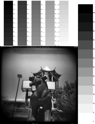
Here’s the file I created to do the test with. The scale at the top goes from 2% to 100 % gray in 2% increments. The scale on the right goes from 0% to 100% gray in 10% increments. The photo is one I took in Chinatown with my Holga toy camera. I scanned the negative, then adjusted curves and levels to make it look halfway decent (not the easiest task-it was expired film, and the Holga allows very little in the way of exposure control, so it wasn’t the most well-exposed negative I’ve used). I posted this photo before, you can see the original here.

After making this test file, I printed it with my inkjet printer (I have an Epson Stylus Photo R1800 with Ultrachrome inks) as a negative image onto transparency film. I made a normal cyanotype print from this negative (with my setup, it was a 12 minute exposure with a bank of ultraviolet fluorescent lights).


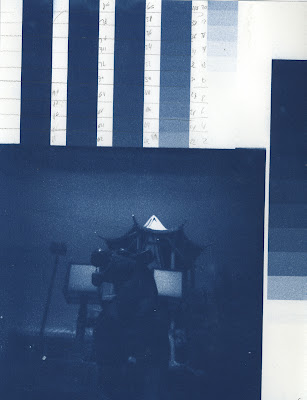
Here’s the first print. The cyanotype process is a high contrast process. It always results in prints with higher than normal contrast. You can see that here, many of the tonal gradients have become solid blocks of color.
Using this print as a guide, I compared the value scales I on the cyanotype with the original scales I made. Photoshop has a transfer function that allows you to replace tonal values with percentage amounts that you enter in. I changed the curves based on the results I got here, and made a new negative and print. That one wasn't much better, so I adjusted curves again, made a new negative (#3, if you're counting), and made a cyanotype from it.


Here’s the result of the second adjustments I made using the transfer function. It’s disappointingly not so great. Maybe a little better than the first two prints, but not by much. Going back over my work, I discovered my first mistake. I was adjusting the curves backwards. Instead of looking at the original grayscale image and seeing how the values corresponded to the print, I was looking at the values on the print and adjusting the transfer curves to match them.
So, I did a major readjustment of the curves, fixing my error, and printed out yet another negative on transparency film (I also reworked my test image).


Here’s the result. It’s the best one yet, but still needs some work. So, I adjusted the curves again, printed out another negative, and made a cyanotype. It looked like crap. I’ll spare you having to look at it. I couldn’t figure out what could have gone wrong, I did everything right. Growing ever more frustrated, I showed them to a friend (who happens to be a mathematician). He found the problem right away: Apparently, I can’t make adjustments based off a print that has the curves corrected. If further correction needs to be made, I have to start back at the original print, look at the values there, and adjust. There’s a mathematical name for this which I can’t remember. The frustrating thing is that this wasn’t mentioned at all in the book I’m using to guide me through this process. To quote from the book, “If the print still needs more density corrections, go back to the transfer dialog box, readjust the percentages, and make another negative and another cyanotype”. That’s it. Had the author added one some sentence, something like ‘Remember to adjust the percentages based on your first print, not prints made from already adjusted negatives’, I would have been spared several day’s work and lots of frustration, not to mention the ink, transparency film, paper and cyanotype chemistry I wasted.
At the risk of stereotyping, many artists (myself included) are, well, mathematically impaired. Even if we’re not, we’re not necessarily thinking of mathematical functions while making art. When you’re writing a textbook for artists, you should keep this in mind!

Anyway, armed with this new info, I readjusted the curve yet again, made a new negative and a new cyanotype, and got a beautiful print with a full tonal range.


Very happy with this, I took a couple of digital photos, threw them on a page with a value scale, made a negative and print, and got this:


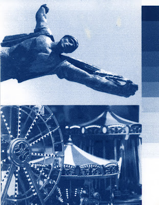
This is a really good looking print, with a good tonal range. I saw some minor adjustments I wanted to make here, especially with the image on the top, which I plan on using in a piece. These adjustments were much more frustrating and time consuming than I expected, one of the other photos I need for a piece I‘m making needed major adjustments to look right. Finally, however, I got it right, printed a sample negative, and got this result:


Beautiful. I love it. Of course, as luck would have it, I’ve encountered more problems. Now that I have the transfer curve down to get perfect negatives for cyanotype prints, I’m finding that when I make large (13” X 19”) negatives on my printer, there is banding which shows up in the resulting print. This has never been a problem with this printer before. Large color prints come out beautifully, and the negatives I made last summer were fine as well. I’ve tried everything I can think of, from changing low ink tanks to cleaning and aligning print heads, etc. Nothing has worked. I’ve printed at least 6 copies of a 13” X 19” negative that are useless due to banding. However, I may have solved the problem. Looking at the negatives through a loupe, I think the banding occurs in the color inks (not the blacks). I’m printing the grayscale negatives with full-color inks, based on the advice of the book I’m using. The negatives I made last summer were all done in grayscale (no color inks). Thinking that the banding might be due to large sheets of thin transparency film not rregistering with the color ink heads correctly, just this morning I printed out a new copy of my test negative using only black inks. Of course, this means I’ll need to run the calibration tests over again, but I know what I’m doing this time.


I’ll keep you posted. Wish me luck!

Thursday, September 6, 2007

Vacation photos pt. 2


Here’s a few more vacation photos. This will probably be the last of them I post here. I’ve been making good progress with digital negatives, and am almost ready to post some sample cyanotype prints made from them.

These photos were all taken in Budapest. Budapest is a beautiful city, as muscular and bustling as Amsterdam is cute. I shot a few photos in Budapest that I’m going to use in my work, but for now, enjoy some pretty tourist shots.