Thursday, April 19, 2012
Some New Collages
Here are a few recent collages. This one was made about a month ago.
This one was made around the same time as the first one posted above.
I made this one in mid-January, right before school resumed. It's one of those 'throw it together in ten minutes' collages I do on occasion.
I made this one in January, but it felt unfinished to me, so it sat in a folder of collages in progress until last week, when I realized it wasn't unfinished after all.
Saturday, March 31, 2012
A Great Idea (Round Two)
My previous post was about a creative collaboration started by photographer Jane Fulton Alt. She provided an original photo, and invited artists to alter or use it in any way. She then posted the results on her blog, and announced round two. I enjoyed round one, even if I was a little intimidated by her photo, and asked to participate in round two. The timing was good-I was about to start Spring break, and knew I would have the time and energy to devote to a second collaboration.
The photo for round two was an interior of an Arts and Crafts style house. I live in a Prairie style house (from that era, anyway), which may be why I felt more comfortable working with this image. As it turned out, however, it took several attempts before I made a piece from this photo that I felt worked. The collage at the top of this post is actually my third attempt.
I tried maying a cyanotype/VanDyke brown combination print first. I found a piece of wallpaper that looked like it could go in that room, and made a border out of it. I like the border, but the cyanotype/VanDyke brown combination didn’t work here. Combining those processes can lead to very unpredictable results. Part of the issue here might be that as an experiment, I printed the cyanotype layer using a negative transparency, and the Van Dyke brown layer using a positive transparency, and the result looks odd. Adding to the failure, the Van Dyke chemistry bleached the cyanotype layer quite a bit, another common issue when attempting these prints.
For my second attempt, I tried making a cyanotype print of the photo (without the wallpaper border) onto a page from an old magazine. Cyanotype is generally easy to do, but it can be a little fussy about the paper used. I chose magazine pages that carried some ‘homey’ content to relate to the photo, and started printing. After four attempts, I decided that the March, 1960 Better Homes and Gardens isn't a good surface to print on. The best of the four tries is what you see here.
With two failed attempts, I decided to try my first idea, which was making a collage (a real cut and paste one, not a digital one). I started by altering the color of the photo, aiming for an old, faded photograph look. I printed it, and made a collage on the print. Thumbing through an old elementary school science textbook, I found an illustration of a girl, her face lit by sunlight. I knew it would look like the lamp in the photo was lighting her face, so I cut out the figure, and it fit perfectly. The baby (from the same textbook) seemed to fit well, and with the girl, made me think of babysitting. That didn’t seem enough to base a collage on, so I decided to play with scale in a Magritte-like manner. As soon as I stuck the pear on the chair, I had my theme: A young girl, on the cusp of adolescence, staring at symbols of fertility and fecundity. I also knew I needed eggs to go on the chair at the right side of the photo. I had to look through about five old textbooks to find eggs the right size.
I like this collage quite a bit. Unlike a lot of my recent collage work, this has a definite content that is (hopefully) pretty easy to discern. I enjoyed the collaboration as well. I think there should be more of this in the art world.
Tuesday, March 6, 2012
A Great Idea
I've always loved the idea of artistic collaboration, even though my experiences with it have sometimes proven frustrating. I also really love the idea of artists sharing their work with other artists and allowing them to remix it (all my work posted to this and my Photo A Day blog have Creative Commons licences which allow you to share and adapt it). This project, allowing for collaboration and remixing work, was really appealing to me.
My piece for this project is at the top of this post. The landscape photo inside of the larger image is Jane Fulton Alt's image. I like her photo, so much so that I had a bit of a creative block when trying to figure out what to do with it. I finally setled on doing a piece similar to some collages inspired by pareidolia I've been making sporadically over the past year or so.
Here's the post on Alt's blog where you can see all of the entries. Mine is near the bottom of the post. The good news is that she's doing round two. Read the bottom of that post for info on how to participate.
Saturday, February 25, 2012
Instant Film Collage
These are collages made from discarded instant film prints. Most of these discarded prints are the detritus left when making instant film transfers. When making transfers, the peel-apart Fuji film (very similar to Polaroid film, which is no longer made) is peeled prematurely, and the usually discarded paper backing is placed face down on a receiving surface and pressure applied to transfer the dyes containing the image. This process leaves a print which has very little visible image (as the dyes have not transferred to the print), but often has interesting textures and colors.
The alternative process photo class I taught last fall made instant film lifts and transfers, and I gathered up a bunch of the discarded prints. The prints are small (about 3.75 X 4.25 inches), and I was interested in making mini-collages on them.
The small size works well with the uncluttered, minimal feel I've been aiming for with my recent collages.
I also like the white borders which frame the collages and emphasizes the photographic origins of these pieces.
Friday, February 17, 2012
Recent Collage
Here are a couple recent collages. This first one really isn't that recent, I think I made it last August.
This one is more recent. It was made last month. The baby photo had been sitting around my studio for months, resisting all attempts to make a collage out of it. I finally got sick of looking at it and threw this together in about fifteen minutes one night.
This was made around the same time as the baby one. I like the simplicity of these collages. Making uncluttered, minimal work has been my approach when making collages for a few months. I seem to go in cycles, slowly building in complexity until the collages seem too busy, then not working in collage at all for a period. When I return to making them, the simplicity has usually returned as well.
Wednesday, February 8, 2012
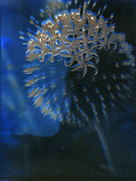
Blue Van Dyke
Last semester, I taught a brand new class, Alternative Process Photography, for the first time. The class was great fun to teach, and the students who enrolled enjoyed it as well. We worked on scanographs (using flatbed scanners as cameras), cyanotype prints, Van Dyke brown prints, instant film lifts and transfers, and explored mixed media work incorporating alternative process photography.
There was another process which we tried, that to be honest I was unsure about. Blue Van Dyke (BVD) printing involves combining the cyanotype and Van Dyke brown processes in the same print. This is usually considered near impossible, as the chemistry used to produce both those processes are incompatible and will ruin the print if combined. I was browsing through The Book of Alternative Photographic Processes by Christopher James (a really good book for those interested in these processes) looking for something I could use as a class assignment, and discovered a chapter on the BVD process, which I had pretty much ignored in my previous readings of that book.
The process looked pretty simple, so I ran a couple of quick test prints during class to see how well it worked. Basically, you print the cyanotype layer first, but give the print twice the exposure as usual, which overexposes the print. For the Van Dyke layer, the Van Dyke chemical solution is diluted 50% with distilled water, and this layer is also given double the exposure time. The Van Dyke solution bleaches the cyanotype layer quite a bit, but the fact that it’s overexposed keeps it from completely disappearing. FIxing isn’t recommended, as it ruins the cyanotype layer, but to not fix the prints means the Van Dyke layer will change if it is exposed to light. I worked around this by briefly immersing the prints in a highly diluted sodium thiosulfate (fix) solution. It did bleach the cyanotype, but not much.
The first print (at the top of this post) is a standard BVD image. I wasn’t paying close attention when I printed the Van Dyke layer, and the negative was out of registration, but it looks good that way. For my second test, I found an old transparency used as an illustration for a 2D Design lecture in my file cabinet, and made a print of that:
I masked the edges of this print after the cyanotype layer, to retain the deep cyan tone around the border. I also flipped the transparency when printing the Van Dyke layer, just to see what would happen. Unfortunately, I left it in the fix too long and the Van Dyke layer bleached out. I printed that layer a second time, but that caused the cyanotype layer to bleach more. Still, not bad for a test print.
This print was made by exposing a cyanotype print without a negative, resulting in a solid blue. I coated the Van Dyke solution over it, and exposed it using a transparency. It’s a little dark, but I like how it looks.
With several test prints turning out successfully, I decided to try a BVD assignment for my class, figuring that if it didn’t work, at least it wold be a reminder of the sometimes unpredictable nature of archaic photographic processes.
It turned out to be an interesting assignment. While not every student got good results, several did.
These BVD prints are the work of Anthony Cox. Both of these images started as scanograms (he really took to scanograms and made some great ones) which were printed onto transparency and used as negatives. Anthony has a really interesting blog which you should take a look at.
Kevin Jaderberg made the following two prints. Both are made from the same image of a trash can, fence and shadows. With both of these prints, the negative was flipped when printing the two layers (similar to what I did in the second test print posted above). I really like the lines in these prints.
I’m not sure if I’ll have a BVD assignment when I teach this class again next Fall, but I’m pretty sure I’ll be incorporating it into my own work. It's fun, easy, and allows for a lot of experimentation.
Sunday, January 1, 2012
Subscribe to:
Posts (Atom)