
Come see my work along with work made by my colleagues!
The annual faculty exhibition at Moraine Valley Community College's Fine and Performing arts center.


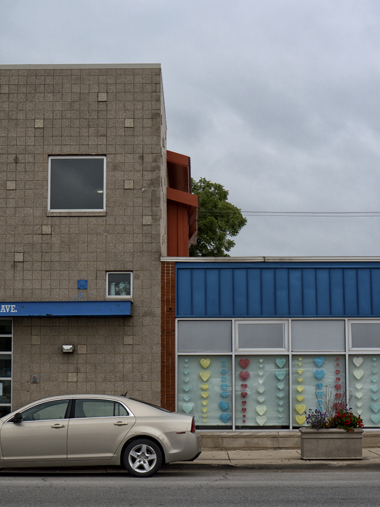
For my seventeenth ‘keep me sane during the pandemic’ photo shoot, I returned to Blue Island, a suburb just south of Chicago I had already shot twice on these outings. My first of these weekly shoots was to the Olde Western area of Blue Island, and I returned a few days later to shoot on a rainy night. I shoot in Blue Island often because it’s close to home and easy to get to, and I find it kind of photogenic. It’s also good when time is short but I still want to get out and shoot, which was the case this time. With the Fall semester in full swing, I had to focus my attention on teaching, and any shooting trip would have to be a quick one. Also, I had hurt my knee, was painfully hobbling around wearing a brace, and didn’t want a longer outing with lots of walking (although I ended up walking for about 1.5 miles, until the knee hurt too much to continue). I chose the north end of Blue Island, which looks less like a small town than the areas I shot in earlier, and more like an aging suburban area, which, if I’m being honest, is exactly what it is. I love mid-century architecture, especially the low rise commercial buildings found on the edges of cities, and there’s a few of them in this area, so that made the shooting fun.
In case you’re wondering, I still don’t know what was up with my knee. I ended up braving a visit to a medical facility during the pandemic to see a doctor about it, but they didn’t think there was anything serious. X-rays revealed a completely normal knee. Wearing a brace for a while and icing it a couple times a day eventually took care of the issue. Guess I’m just getting old!
Here are my favorites from this shoot.


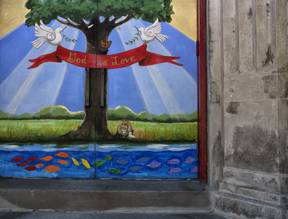
My sixteenth ‘keep me sane during the pandemic’ photo shoot can’t really be called a summer shoot. It occurred in early September, still summer by the calendar, but fall was starting to make its presence known. This was also after the school year and full-time teaching duties resumed for me, and keeping myself busy was no longer an issue (after a summer filled with stress wondering if my classes would actually run, it was kind of a relief to be busy with work). After two weeks in front of the computer, countless emails, lesson planning and videoconferences, however, it felt really good to step away from all that and enjoy a few hours shooting on a sunny, quite warm but not too hot summer/fall cusp day.
I chose Bridgeport, a neighborhood on Chicago’s near south side. I had shot in a different area of Bridgeport a few weeks earlier, and have shot there a couple times in the past, and knew it would be an interesting area for me to shoot in.
The central area of Bridgeport, where I shot on this outing, is a pleasant area with an almost, but not quite hipsterish/artsy feeling. Many artists live in the neighborhood, and there has been a strong artist’s presence in the area for decades. There are a couple prominent art centers in big old warehouse buildings in the area, and a sprinkling of galleries in storefronts. Even with all the artists in the neighborhood, however, it has never quite shaken its working class roots, or its unfortunate race issues. Chicago’s history is fraught with unpleasant race issues, and Bridgeport is an area which comes up often when discussing them. The location of the I-94 expressway, for example, along the east edge of Bridgeport is largely believed to be a purposeful attempt at creating a barrier between the neighborhood and Bronzeville, a historic area long known as a center of African-American culture in the city, which lies just to the east of the expressway.
While maybe lessened in recent years, and while it now is considered one of the most ethnically diverse areas of the city, unpleasant race issues remain in Bridgeport.
None of that was evident while I was shooting there, however. There were people in the cafes and restaurants that dot 31st. St., kids playing in playgrounds, and it felt relaxing wandering through the neighborhood shooting photos. Here’s my favorites from this shoot.


 |


