Saturday, December 27, 2008

New Postcards


I’ve just returned to Chicago after visiting family in Michigan for a few days. Rural mid-Michigan isn’t the most exciting place, so while I was there, my sister and I entertained ourselves by making collaged postcards. Armed with several old magazines, we worked without any goal besides making something.


We made these postcards intending to use them for Postcrossing. Postcrossing is a project where you send and recieve postcards from random people around the world. I’ve been doing it for several months, and my sister and mother have done it as well.


Afer making several poscards, my mother joined in. Her contribution was to supply us with bits of text, which then became the theme of a postcard.


What started as a way to pass time resulted in some interesting work. Some of the cards came out pretty well. I’ve scanned some of my favorites, and may clean them up and list them as prints on my Etsy page.

Saturday, December 6, 2008

My Top Five

My friend Brady recently posted an interesting challenge to “artists and artist wannabes” on his blog. He asks “If you were to go through your work from the last year, could you identify five that, for one reason or another, you like best?”
I love that question. I personally find that in my studio work, I tend to move from one idea or project to another, without much reflection on what I’ve accomplished. Looking back at what I’ve made over the past year is probably a good exercise for that very reason.

2008 was kind of an odd year for me, art-wise. It started at the tail end of my sabbatical, as I was working feverishly in the studio exploring alternative photographic processes. After my post-sabbatical exhibit opened in the spring, my studio work slowed to a trickle as I concentrated on teaching duties. The summer wasn’t as productive as it should have been. I shot a lot of random photos, but a large, stressful, remodeling project (with long delays-the 2 1/2 week estimate turned out to be an 8 week project) kept me from the basement workspace I used for making prints. The remodeling finally was completed (and I got a new darkroom as part of it), but by then I was back in school, and my attention and energy were focused elsewhere.

So, here are my picks. It was difficult narrowing it down to five, but ranking them was even more difficult. I’m not sure the order would stay the same if I rethought it, but what’s most important is that these are my five favorite pieces made this year.

#5

This past summer, I started making cyanotype bookmarks as a way to use up some scrap paper and keep busy in the studio between projects. I ended up designing and printing over twenty different bookmarks. They were a lot of fun, and some of them came out pretty well. This one’s one of my favorites. It’s a little surreal, but more fun than weird. I’m currently relisting this one and my other bookmarks for sale on my Etsy page. I'm also listing a larger version, approx. 3.5" X 18.25“ in a limited print run.

#4

This cyanotype print is made from a Holga photo shot in San Francisco’s Japantown in October , 2007. The print was made sometime late last winter. I love the composition in this image, and the prominent use of negative space. It didn’t fit well with the other work I made at the same time (much of which was in my post-sabbatical exhibition last spring), and as a result hasn’t been seen publicly aside from this blog.

#3


In my original post for this piece, I wrote that it looks like a still from a Guy Maddin film. It’s a duotone gum bichromate print, and it really should be printed a couple more times (gum bichromate prints are made by printing a series of layers of different colors. The more layers, the more intense the colors become). I stopped here because I really liked the gray and light yellow in the print. I made a second version of this print which I exhibited in my show last spring. That version was made with metallic gold acrylic instead of the standard watercolor paints used to make gum prints. It turned out much darker, and has a slight metallic sheen. I still like the faded look of this one, however. The photo was shot in Chicago’s Chinatown with my Holga camera.

#2

My most recent piece, currently hanging in the gallery at Moraine Valley Community College as part of the faculty exhibit. Scroll down a couple of posts to get the full story. This shot, quickly snapped after pinning the piece up to my studio wall, really does not do the piece justice. It looks much better in person.

#1

This gum bichromate print was actually finished in the afternoon last December 30. Close enough to be considered work I made this year. The photo was taken in Chinatown here in Chicago on the day after Thanksgiving. I like this piece for a number of reasons. The photo itself is interesting, I like the subject matter (knickknacks in a shop window) and the use of short depth of field. The print came out really well. It was the second ‘real’ gum print I made after several weeks of running tests to control exposure and color balance in a notoriously picky printing process. I was really happy with the color I got here, and it encouraged me to go further with gum printing.

Sunday, November 30, 2008

San Fran Polaroid Tran


I made this Polaroid transfer last week while demonstrating the process to some of my students. I like how it came out, and decided to post it here. The image this transfer was made from was created in a Photoshop class I took a couple of years ago as a refresher. It started as a photo of brightly painted houses in San Francisco. I manipulated that photo, adding the paisley to the sky and changing the color. I had taken a slide of that image last year, but didn't do anything with it until now. I like how it came out, even if it is backwards. I could flip it easily, but it really doesn't matter in this case.

Friday, November 7, 2008

Self Portrait as a Drowned Man (After Bayard)


Here’s my latest piece. I finished the last bit of work on it a few days ago. I made this piece specifically for this year’s annual exhibit of faculty work at Moraine Valley Community College, where I teach, although I’ve had the idea for this piece for several years. It was one of those ideas that was too good not to pursue, and with the theme of this year’s faculty exhibit being self portrait and autobiographical work, the time seemed right.

The piece is made of twelve cyanotype prints. The prints are made on copies of rejection letters I’ve received from various galleries. Here's a close-up of the piece so you can see the letters the piece is printed on (click on the photo to see a larger version).


This piece is based on a well known historical photograph by Hippolyte Bayard. Bayard was one of the first inventors of photography, but was given duplicitous advice which allowed Louis Daguerre to receive the French patent for the invention of photography (that’s why you’ve heard of daguerreotypes, but not bayardotypes). Bayard’s response was to pose as a corpse, an apparent suicide due to the injustice and lack of recognition for his invention. Ironically, the image became famous as the first staged photograph, and can be found in nearly every book on photographic history. Here’s the original Bayard photograph I based my piece on:


I originally wanted to print directly onto the actual rejection letters, but that proved to be unworkable. Many papers use bleach in the manufacturing process, and residual bleach in the paper bleached the cyanotype prints. I made several test prints that looked great when first developed, but when dry, had bleached so much that the image was very pale.

I wanted the piece to look as much like it was printed on the actual rejection letters as possible. After trying a few experiments, I arrived at a solution that worked (for the most part). I scanned all the rejection letters, and printed them on a matte surface Epson inkjet paper. I generally like Epson papers, and was very surprised that the ink held up to the cyanotype process. These prints were washed in a tray of water for about 20 minutes, and the ink did not run at all. Epson claims their ultrachrome inks (the type my printer uses) are water resistant, but I never expected that I could expose them to this much water without the ink running. There was one drawback to using the Epson paper, however. The cyanotype solution stained the white areas of the prints yellow, and no amount of washing would remove that color. I decided I could live with it.

This work is obviously a self portrait, but it is autobiographical as well. By printing the piece on rejection letters I’ve received from galleries, I’m not just referencing the rejection Hippolyte Bayard felt when he lost the patent. I’m commenting on my (lack of) success in the world of commercial galleries (in a lighthearted way). I have an ambivalent relationship with commercial galleries. While exhibits in commercial galleries are often considered the primary goal of the working artist, I just do not enjoy the smoozing and ass kissing that often accompanies them. I also know firsthand (I worked briefly in a gallery when I first moved to Chicago) that decisions in these galleries are made based on commerce, not artistic merit. I’ve done really well at academic galleries, non profit spaces, etc., but my work doesn’t have seem to have much commercial appeal. I’m comfortable with that, although I still dutifully leave discs of my work at galleries whenever I finish a new body of work. At least, my efforts have provided me with the letters used to make this piece!

innerview
Autobiographical works and self-portraits by Moraine Valley faculty

Nov. 17-Jan. 8
Reception: Thursday, Dec. 4, 2-4 p.m.

Robert F. DeCaprio Art Gallery
Fine and Performing Arts Center
Moraine Valley Community College
9000 W. College Pkwy.
Palos Hills, IL

Wednesday, October 8, 2008

More Postcards


Here are two more postcards from the series of reworked postcard collages I originally made in 1988. I haven't been working on these for several weeks. I may return to them in the future, but for now, the project has kind of run out of steam for me. I felt like I was starting to repeat myself with these pieces, and "real life" kept getting in the way (this semester is feeling much busier than most semesters do). There are several more of these old collage photocopies that I think have potential, but for now, I'm working on other things.

One of those other things is a piece I'm making for the annual faculty art exhibit at the school where I teach. This year's theme is self portrait and autobiographical work, and I'm making a piece that is both of those things, as well as an art history lesson. I won't go into detail now, I'll post the piece and write more about it when it's finished. If it turns out like I hope, it should be a pretty interesting piece.


I like both of these reworked postcards quite a bit. I don't remember much about the second one posted here, but I do have distinct memories of working on the one at the top of the post. I was pretty proud at the time with how I placed the text over the image. The text 'ugly unwanted hair' appears over the face, 'add four big inches' over the chest, ' 3 inches slimmer' over the waist, and 'longer nails' right at the fingertips. I was trying for a feminist message about body image and societal pressure, which I think comes through (I hope it does).
I'm still planning on selling prints of these postcards on my Etsy shop. I just haven't gotten around to listing them yet. If you're interested, send me a message.

Friday, September 5, 2008

More From The Postcard Project.


Here's a couple more of the reworked postcards I wrote about in the last post. I've completed revisions on six of them, and more are in progress. As mentioned in my last post, I'll probably end up reworking about a dozen of the original 35 cards I made in 1988.

The reworked postcard at the top of this post is my favorite one so far. I used a scan of a piece of wallpaper for the background, and I really like what it adds to the piece. The floral print seems to give the piece a homey feel, and I like how that contrasts with the grainy, black and white of the foreground text and image. The text and image in this piece came from a 1950's era textbook, and leaving it black and white retains a little of the clinical feeling those types of books have.

Here's the photocopy of the original postcard I started with.


Here's another of the remade cards.


This one's not my favorite. I don't dislike it, but it doesn't seem to have the same spark that the others I've finished have. I think it's the background. I wanted it colored, as leaving it white seemed too stark. I didn't want a busy background, however, so I went with gray. The gray is bothering me, so I may end up revising this one further.

Sunday, August 31, 2008

The Postcard Project


Recently, I’ve been revising some work I made twenty years ago.
In 1988, I participated in a mail art project. The project involved making 35 original postcards and mailing them (in an envelope) to someone who was collecting all the cards, and sending back 35 cards from different artists. It sounded fun, and I threw myself headfirst into the project of making the postcards. At the time, I was mostly making collages, and I labored over these 35 cards for about three weeks, clipping images and text from 1950’s homemaker’s magazines, old textbooks, and religious books bought at garage sales, and painstakingly assembling collages out if them. I put a lot of time and effort into these postcards, and I sent them off just before the deadline, then anxiously awaited my package of postcards from other artists.

When the package arrived, I was pretty disappointed. I received 35 cards, but most of them were pairs of cards from an artist, instead of cards from 35 different artists. Much worse than that, however, was that many of the people involved obviously put no effort whatsoever into their cards. One person scribbled on a piece of poster board with several differently colored markers, then cut the board into 4 X 6 inch squares. Another glued whole pages of newspaper onto a sheet of poster board, and cut that into squares. I even received two of my own cards back (which I can’t seem to find right now). Receiving two scribbled pieces of board seemed pretty bad after pouring so much effort into the project. While there were a few decent photo cards in the package, many of the 35 cards ended up in the trash.

When I made my collaged postcards, I ran up against the deadline for mailing them and had to send them off before documenting them (this was years before I owned a scanner or a copy stand). Figuring it was better than nothing, I had my sister take them to work and make B&W photocopies of all 35 postcards. These copies have sat in a folder in my file cabinet for 20 years, until now.

With the home remodeling project (which just passed week five of the supposedly three week project-and it’s still not finished) I’ve been without my basement workspace for making alternative process prints. Tired of sitting around waiting to return to the studio, I pulled the 20 year old grainy B&W photocopies out of the filing cabinet, scanned them all, and have been digitally revising and coloring some of them.

Here’s the original photocopy of the revised card seen at the top of this post, for comparison.


Of the 35 cards, probably a third of them really aren’t very good and are best left buried in the file cabinet. I remember running out of steam about 3/4 of the way through making them, but forcing myself to push out a few more. Another third are ok, but nothing much can be done with them. That leaves about a dozen or so postcards that hold up decently well after 20 years, and that might benefit from being reworked and updated. I decided not to try and recreate the cards as they originally looked. After 20 years, I can’t remember how they looked in their original state, and in some cases, it’s hard to recreate anything from a grainy photocopy. Besides, it’s more fun making something new out of them.

Here’s another one, the original first, followed by the revision.


As of this writing, I have four of the cards completed, and two or three more in progress (including one that I’ve done two versions of, and don’t like either one). I enlarged a couple of them and printed them, and they look great. So good, in fact, that I’m thinking of listing them as prints on my Etsy page.

I’ll post more of these postcard revisions in a couple of days.

Friday, August 29, 2008

Adventure Time


This quirky, offbeat, and totally charming cartoon short has just been picked up as a series by the Cartoon Network. I can't wait. I was laughing out loud watching this. It's bizarre, in a good way.

Tuesday, August 26, 2008

Watch This Space

I'll post some of my own art here soon. Meantime, check out this great PSA about art education:

Thursday, August 14, 2008

Photo Essays


Still not much happening, art-wise. The remodeling project in my house keeps dragging on and on, so I am without my basement space for making prints right now. I start teaching classes on Aug. 25 after having the summer off, and it's looking like the remodeling won't be finished before I resume teaching. I was hoping for a small break between the time the project is finished and school starts, to regroup and start working on my new darkroom (which is part of the remodeling job). That's not going to happen, so I'll have a few weeks of teaching while simultaneously putting the darkroom together. Should be nice and exhausting!

I have been doing some shooting, and have some ideas for things I want to start working on. I also have a few negatives for more bookmarks ready to print, which I probably won't be able to do for a few weeks.

I've also uploaded quite a few photos to JPG magazine, including a couple of photo essays. These are basically groups of thematically linked photos with a bit of writing. The first one I titled The Institute. It's several photos I took of the models for a new wing the Art Institute of Chicago is constructing. I've made cyanotypes of several of the photos I shot of these models, some of which I posted to this blog over a year ago.

The most recent photo essay I posted to JPG is titled Night at the Fair. It's a selection of photos I took at a small carnival back in 1996 using color saturated film.

Posting to JPG magazine and making bookmarks haven't really replaced making art, but it has kept me busy through a summer in which my studio work has taken a back seat. I know from past experience that as soon as I return to teaching, having a structured work week will likely push me back into the studio.

Saturday, August 2, 2008

Yay! More Bookmarks!


OK, I really wasn't planning on posting any more bookmarks on this blog, but I really don't have anything else to show right now. Work has been going really slowly this summer. Several attempts at gum bichromate prints haven't turned out well (I have a couple that need one more layer, but I've been avoiding finishing them, because I know I won't like them when I do).


Meanwhile, my basement work space has been torn up due to a remodel/construction project we're having done to the house. Eventually, the construction will be over, and as part of that project involves building a real darkroom in my basement, I'll soon have a nice space to work in that I don't have to share with the washing machine and that I can make light tight. I'll be able to develop film and print B&W photos, not just alternative process photos.


Until then, I'm stuck, as far as printing is concerned. I probably could attempt some alt process prints, but I'd have to move junk and rearrange stuff for an hour in the basement before starting, then put it all back before the construction resumed the following day.


I've actually been doing a decent amount of shooting, especially with my Holga camera. Some of those will likely turn up on my Photo A Day blog pretty soon.

So, it's more bookmarks. These have been on my Etsy page for a while, but are making their first appearance here.

Sunday, July 20, 2008

Animation News

I'm a huge animation fan. Some of my all-time favorite movies and tv shows are animated, and there's always a couple of cartoons on my Tivo's to do list. This weekend saw a couple of animation related events that I'm excited about.

First, here's the trailer for Ponyo On The Cliff, the latest film by Hayao Miyazaki, which opened this weekend in Japan.


I'm a huge fan of Miyazaki's work, his Studio Ghibli is arguably making the best animation in the world right now (OK, maybe it's tied with Pixar). If you haven't seen any of Miyazaki's work, drop everything, run to your nearest video store, and rent a copy of Spirited Away. Ponyo On The Cliff looks like another great film. I haven't heard when it will be released in the USA, but I'm hoping it won't be too long.

As long as I'm on the subject of animation, the final episodes of Avatar: The Last Airbender aired this weekend on the cable channel Nickelodeon. I was out of town, and didn't catch them, but I have them on my Tivo and will finish them soon.

I must admit I'm a total Avatar fanboy. I could go on at length (and have, just ask my friends), but let me just say that it's no hyperbole that Avatar: The Last Airbender is the best animated series in at least a decade, and will likely be considered one of the best animated shows of all time. Trust me, it's that good. I wouldn't have named this blog after it otherwise!

If you haven't seen this show, I can't recommend it highly enough. The animation, writing, and art direction are of a quality rarely attempted in a children's cartoon program. Even the music is exceptional (I'm hoping for a soundtrack cd). Start with the first season, and watch the episodes in order. The story builds over the three seasons, and some of the characters go through significant development as the series progresses.
Avatar wasn't cancelled, by the way. It was planned from the beginning as a three season series with a finite number of episodes.

One more thing: If you haven't yet, go see Wall-E. It's excellent.

Friday, July 11, 2008

From The Archives II

I have a couple of gum bichromate prints nearly finished (I’m hoping to print the final layer today). I’m pretty sure they won’t turn out well, which has been the case with all the gum prints I’m attempting this summer. I have a few more images I’m working on, but they are still in the digital stage, and haven’t even been printed as negatives yet.

With work progressing slowly, it seems like a good time for the second installment of From the Archives, wherein I post an old piece of work and write some comments about how it was made and what I was thinking about (you can read the first installment here.


Altarpiece was made in the fall of 1996. It’s the first piece I made while in graduate school at Cranbrook Academy of Art (technically, it’s a revision of that piece. When first made, it was prints only, I didn't have the bowling ball and pins yet). While it looks like a first graduate school piece (it’s a little overambitious, and could have been thought through a little better), I still really like the piece. It’s one of the few times I’ve ventured into installation-type work, which I appreciate, but don’t feel very compelled to produce. It’s also funny, and the humor in the piece seems natural and isn’t forced.

Here’s a short statement I wrote after completing the piece:
Altarpiece unites the iconography of two very different American cultural institutions, religion and sports. Bowling is the quintessential American sport, being a pastime for the masses and recreation for the non-fit and non-elite. The imposition of bowling imagery onto the basic triptych form of an altarpiece comments on the fervor and passion felt for sports in general and also on the elevation of sports in our culture to an almost religious station.
Altarpiece is a mixed-media work, combining hand-colored black and white photographs with gold leaf, a wooden pedestal, bowling ball, and bowling pins. The negatives used to print the photographs were created digitally from various appropriated and original source images.


The digital negatives made for Altarpiece aren’t like the ones I make now for alternative process photography. Back in 1996, inkjet printers did not lay down enough ink to make a useable negative. For this project, I had to take my digital files to a commercial printer and have 4X5 transparencies made (at about $15 each). I used those transparencies to print real photographs. The images came from a book on bowling instruction, and a history of altarpieces checked out of Cranbrook’s library. The photo of the bowling trophy I took myself (see below).

I’ll finish with a couple anecdotal stories about gathering the bowling paraphernalia.
I needed a bowling trophy to photograph for the center panel, and couldn't find one anywhere. At the time, my sister was living across the street from a thrift store in Chicago, and went there to look for one. She misunderstood what I needed, and ended up buying about 15 bowling trophies that happened to be in the store. I used them to decorate my studio at school, and all year long, people thought I was a bowling fanatic. I kept the one I used for the center panel (It’s still in my studio, on top of a bookcase), but I don’t know what happened to the rest of them. They’re probably still decorating student studios at Cranbrook.
I also had trouble finding a bowling ball (I didn’t want to spend money on a new one), but a friend at school said she would bring one back when she went home for the holidays. Turns out, home was Fresno, CA, and the purple bowling ball (in a tacky baby-blue case) was her carryon luggage for the flight back to Michigan. I wonder if you could carry a bowling ball onto a plane today with all the ridiculous new ‘security’ measures?

Altarpiece won a juror award at an exhibit titled Myth America at the Urban Institute for Contemporary Art in Grand Rapids, MI in 1997. I also exhibited it at the annual faculty art exhibit at Moraine Valley Community College in 2006 (the show’s theme was showing older work alongside current work), where it received many interesting comments.

Wednesday, July 2, 2008

Road Trip To Milwaukee

If you read the last post, you'll know that I'm busy with home remodeling this summer. Not so busy that I can't take a couple of weekend trips, however, and one of those weekenders is going to be to Milwaukee. The Milwaukee Art Museum has two exhibits this summer that look really interesting. Gilbert & George are a British art (and life) partnership that make immense, brightly colored photo mosaic/collage pieces with provocative content. Some of their work is really great, and it's all worth seeing.
The Sensory Overload exhibit of Kinetic and Op art looks interesting as well. Both exhibits look infinitely more interesting than the Jeff Koons show at the Museum of Contemporary Art here in Chicago.

Tuesday, July 1, 2008

Return Of The Son Of Bookmarks Strike Again Part IV


I haven't done much with my gum prints in progress for the past few days. I haven't been terribly motivated, to be honest, after getting crappy results every time I try lately. I'm also busy with other (non-art) things.

We're adding a bathroom to the house, to replace a tiny one off of the kitchen that will eventually become a pantry. I've been to more tile stores, bath fixture shops, and Home Depots in the past couple of weeks than I'd like, and I'm not done yet. Part of that project will be adding a darkroom to my basement, which is great, but the construction is likely to shut down my basement workspace (and the ability to print) for a couple of weeks.


It's not all been tedious trips to look at sinks and toilets. An old friend from college, whom I haven't seen for ten years, passed through Chicago while taking the Amtrak to visit relatives in Michigan. I met her at Union Station downtown last week (her train was over five hours late-mass transit really sucks in the US), and again yesterday when she was making her return trip to South Carolina.
I have friends coming into town for July 4th weekend as well, which will be fun, but I won't be doing much in the studio while they are here.


So, here's more of the bookmarks I've been making and selling on Etsy.com. I've actually been selling a few-right after my last post, someone bought four of them. I've got a few more ready to print, but probably won't do so for a little while.


Thursday, June 26, 2008

Still More Bookmarks


I’m still working on some gum prints, and still having some trouble with the yellow and magenta layers being too intense. Gum prints are notorious for being fussy, even changes in the weather can cause them to turn out differently. That’s the only thing I suspect at the moment-most of the gum prints I’ve made in the past were done in the dead of winter. Now it’s summer, and my basement, where I’m printing, is much warmer and more humid than it was when I was successfully making gum prints. Why heat and humidity would only effect yellow and magenta, however, is a mystery.


Meanwhile, I’ve been making more cyanotype bookmarks, and really enjoying it. I think it’s the ability to do whatever I feel like without regard for creating a cohesive body of work and the creative challenge of working in a tight, narrow format that I find appealing. I also can work on them when I have spare time or don’t feel like doing anything else.


I wasn’t planning on making more of these. But then, someone bought a couple of them from my Etsy shop, and that inspired me to design some more. I now have 29 different bookmarks for sale there.


I’m also experimenting with making larger prints from my bookmark designs. I enlarged a couple of them to 18” X 3.5”, printed the digital negatives, and made prints from them. They came out beautifully, so I listed those on my Etsy shop as well.


These prints are editioned, I’ll only make 25 of each design. Rather than print them all off, I put a note in my Etsy listings for people to contact me if there’s a specific one they are interested in.

Sunday, June 22, 2008

Photographer's Rights


I took this photo in front of a church on the southwest side of Chicago last fall. I had gone there to shoot photos of the rides at a parking lot carnival, but a guy walking around with a camera at a place where children congregate was too much for the college-age security team to bear. At one point I spoke with the pastor of the church, and showed him images I had shot with the digital camera so he could see I wasn't interested in photographing children. He gave me permission to shoot at the carnival, but the 'security' still tailed me so closely that I got uncomfortable and left. On my way back to the car, I spotted this chalk drawing a child had done on the sidewalk in front of the church, and snapped a photo of it. It's more interesting than the shots I made at the carnival. I like how it's kind of charming and funny (and maybe a little creepy) at the same time.

I've heard several accounts recently of people getting harassed for taking legal photos in public places (a student of a colleague of mine was stopped by Homeland Security for shooting a photo of an oil refinery). Here's a short article on the legal rights of photographers. Not surprisingly, you have the right to shoot almost anything you want. There's some useful links at the bottom of the article, be sure to check them out.

Saturday, June 21, 2008

Recent Gum Prints


Here’s a couple of gum bichromate prints I’ve been working on recently. They’re not that great, but it’s an issue with printing, not with the images themselves. For some reason, the yellow layer seemed really overexposed in both of these prints (I printed the yellow layer exactly like I always have, and don’t know what caused it to be so intense). I soaked them in water with a splash of ammonia to remove excess exposure, but that didn’t really work. So I decided to continue on with the other colors, thinking I could print multiple layers to correct for too much yellow.

However, when I printed the magenta layer, everything seemed strongly orange tinted, something that was not improved when I printed the cyan layer. After printing the black layer, I gave up. On one of the prints, I managed to print the black layer out of registration. I tried removing it (usually easy to do when the layer is still wet), but it wouldn’t budge.

I’ll try again with these in a few days. I’m working on two different gum prints right now, and want to finish those before redoing these. I’m trying something different with one of these new prints, and if it works, I might apply the same idea to these images (more on that when I post those prints in a few days).


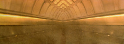
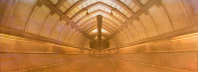
About these images: They were taken in the Washington, DC metro last summer. They are both photos of subway trains moving through stations. I copied the photos and flipped them, to create semiabstract, impossible spaces. I actually made these images, and the color separations for them, last fall, before I had even started making gum prints. By the time I started printing my first gum bichromates, the themes I was working with for my exhibit last spring were much more concrete, and these pieces just didn’t fit. All of the pieces in that exhibit (many can be seen if you look through old blog entries) were straightforward shots with minimal manipulation. Now that the show has come and gone, I’m interested in exploring how color and image can be manipulated, and how those manipulations work with various alternative processes. These two images fit nicely into that exploration.

Friday, June 13, 2008

More Cyanotype Bookmarks


Here's a few more of the cyanotype bookmarks I've been making.


As you will see if you look at the column on the right side of this page, I've now got a bunch of them listed for sale on the Etsy page I set up.


I also printed 12 more bookmarks from new designs last night. A few of them didn't turn out like I wanted, but leaving them aside, I now have 26 different bookmarks.


I'll be posting the new ones to the Etsy page sometime today or tomorrow.


I'm about done making new bookmark designs for now. At least I have no plans to produce many more of them. I do have some ideas I haven't tried yet, and I want to rework a couple of the ones I've already made that didn't work out. I'm also in the middle of making several gum bichromate prints, however, and don't want the bookmarks to grab all of my attention.

Wednesday, June 11, 2008

Cyanotype Bookmarks


Recently, I’ve been making cyanotype bookmarks. I got the idea when I was cleaning my studio a couple of months ago, and found a bunch of scraps of paper left over from making prints. They were too small to do anything with, and to be honest, I don’t know why I saved them.


I made a few designs, then got busy with other things and forgot about them. Wanting to return to studio work after a long absence, I started working on them again this past weekend. As of this writing, I have fourteen different designs printed, and have digital files of about a dozen more that I’ll make the negatives and prints for soon.


I wasn’t planning on doing much with these besides giving them to friends. They’ve turned out better than I expected, however, and the couple of people I’ve showed them to were pretty enthusiastic. So, I’m going to try selling them. I’ve just opened a shop on Etsy.com, and I’ll be listing some bookmarks there soon. I’m planning on selling them for $5 each. I won’t get rich, but it’s fun making them, and I might sell a few.


These are all bookmark sized (about 1.5” X 7.5”) and will be an unlimited run. I’m considering selling larger versions of these images as well. These would be prints (about 18” X 3.5”) and would be in an edition of 25 for each image.


Working in such a long, narrow format was sometimes challenging compositionally, but I’m happy with the designs I’ve come up with. Because I wasn't treating these like serious work, I had some fun and did things I probably wouldn’t have done otherwise.


I’ll post more of these bookmarks in a couple of days.