Saturday, December 29, 2007

Cyanotype On Fabric

Over the past couple of weeks, I have been making cyanotype prints on fabric. The process is pretty similar to making cyanotypes on paper, but there are some differences as well. Doing a cyanotype print on fabric uses about five times the sensitizer that doing them on paper does. Exposure times are also longer. I’ve been exposing paper cyanotypes for 12 minutes, but the fabric ones I’m exposing for 16 minutes.
Also, although I’m using 100% cotton fabric, every fabric is different, and I’m finding that some work really well for cyanotypes, while others don’t work well at all. All the fabrics I’m using were washed several times before printing, to remove any sizing in the fabric. As you can see from the images, I’m printing on different colors of fabric, to see how the blue cyanotype interacts with the fabric color. This of course leads to exposure and contrast issues, but it’s all part of the fun!


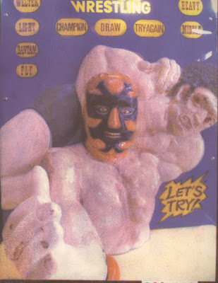
This is the first one I made, and I love it. The red fabric works well, and I like how it’s turned the blue so dark that it’s nearly black.

I posted this image twice before, once as a cyanotype print on paper here and as a toned cyanotype here.
Click on those links to compare the different versions.


This is the second cyanotype on fabric I made. The fabric is dark green. I don’t think it turned out that great, but I’m not redoing it, because I made a version on paper that I like quite a bit.


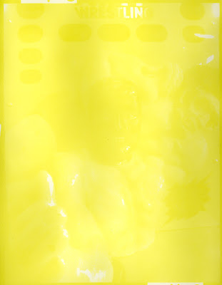
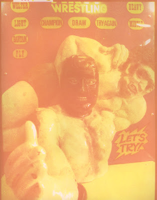
This one’s on bright yellow fabric. It’s underexposed, and the fabric color is too bright for the image. I reprinted it a second time, on pale yellow fabric.


This one’s much better. I like it a lot.


This print was made on a pale rose colored fabric. I like this one quite a bit.


This one was made on the same rose colored fabric. It photographed poorly, and looks much better in person.


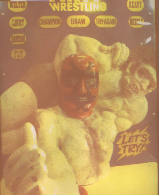
This one looks much better here than it does in person. I really wanted it to turn out well, but it’s dark and kind of muddy looking. I may reprint it with less exposure, but I suspect that the image may be competing with the red fabric.


I love this one. The fabric is an ugly neon green (which looks yellow in the photo), but it works really well with the blue of the cyanotype.


This one was also done on the neon green fabric. It also looks yellow here, but is bright green in person. I like this one quite a bit.

Saturday, December 22, 2007

My First Real Gum Bichromate Print

Well, after over a month spent running test prints to determine exposure, transfer curves, and dilution ratios of paint to gum arabic, I finally have my first finished gum bichromate print.


Not bad, for a first attempt (actually, second attempt, more on that in a minute). I thought it might be interesting to see each color layer and how it effected the print, so I made scans every step of the way.

Here’s the yellow layer.


Yes, it’s very yellow. Look close and you can see hints of an image. This was a 5 minute exposure, which I later figured out was overexposed.

Here’s the second layer, magenta.


As you can see, adding the magenta layer makes the image much more clear. There’s a strong orange-pink look, but I figured that adding cyan would change that.


It’s kind of muddy, and the blues have a strong purple-gray tint. I decided to add a second cyan layer. Here’s the result.


Much better, and pretty close to the final version I got after adding the black layer.


So here it is, the first print. It’s way too yellow, so I decided to make a second version ot the print (which you saw at the top of this post, and I’m repeating here).


The main difference between the first one and this one is that I decreased the yellow exposure by one minute, from 5 minutes down to 4. The resulting change is dramatic. It changed so much that it was looking like it had too much magenta exposure instead of too much yellow. I originally gave this print only one cyan coating, but in an effort to tone down the magenta, gave it a second cyan layer after the black. This resulted in a print that was way too blue, so I carefully removed the cyan from selected areas of the print (when a gum layer is wet, it is very soft and can be removed or manipulated easily, In fact, it’s easy to ruin a print in progress by handling it too roughly while wet).

So, the print you see above and at the top of this post is the second one I made, and the first one with good color. I’m surprised at how much changing the yellow exposure by one minute had on the final image, and I fear that I may have to adjust exposure for one or more colors for every new print I make. We’ll see, I’ve already started printing a 2nd image (the yellow layer is soaking as I write this).

One last image, This is the original photo that the gum print was made from. You can see how much this process changes the color of the image.

Wednesday, December 19, 2007

Recent Work Roundup: Van Dyke brown prints

As promised, here’s some recent Van Dyke brown prints.


I love this one, it turned out really well. The photo was taken in a storefront window in San Francisco’s Chinatown.


Here’s one that didn’t turn out so well. It’s a panorama shot at the Field Museum here in Chicago last summer. It’s a large piece, four separate 13 X 19 inch negatives were printed to make it. Unfortunately, it’s streaky and lacks contrast, and the image just seems difficult to read. I was going to do a second large piece like this, but I’ve put it on hold.


I like this shot a lot. It’s a storefront church around 93rd St. and Ashland in Chicago. I shot it with my Holga camera while on a bike ride this past fall.


This one’s kind of a throwaway. The previous image of the storefront church is a 13 X13 inch print, and I didn’t want to waste the 13 X 6 piece of transparency left over from printing that negative, so I threw this together quick. taken in San Francisco’s Chinatown, it’s not a bad image, but I’m not sure I’ll use it.

I had a bad print session a couple of weeks ago. I made the three following prints and like them all, but they all need to be reprinted. I posted the original Polaroid lifts of these images here.

I scanned those lifts, and printed negatives of them to make these Van Dyke brown prints.


Sunday, December 16, 2007

Recent Work Roundup: Cyanotypes

Here’s some cyanotype prints completed over the past few weeks.


This is a statue at the Aquincum ruins in Budapest. I made a Polaroid lift of the photo, scanned it, and printed a negative from the scan to make this cyanotype.


This is a shot of the San Francisco skyline taken from the top of Coit Tower. The window openings are covered by plexiglas, and visitors have pushed coins through the gap between the plexiglas and the wall. The coins land on the wide ledge. I like this print quite a bit. I really like the look of the raindrops on the plexi that show up in the upper right side of the print. However, I’m not sure this print fits in with the other work I’ve been making.


Three photos of blank signs and billboards, all taken with my Holga toy camera while riding my bike. I plan on mounting these as a triptych in a large frame.

Look for some recent VanDyke brown prints to be posted in a couple of days, along with my first real gum bichromate print (not a test print) which I’m still working on.

Thursday, December 13, 2007

More Gum Bichromate Test Prints

I’m still testing three-color gum bichromate prints, trying to work out all the variables. Here’s test print #6:


I added a black layer to this one, as I was feeling that the other test prints didn’t have enough dark values. Rather than start from scratch with CMYK separations, I opened my original test file in Photoshop, split it into CMYK separations, but only printed the black separation. As you can see (or not), the black barely shows up. So, I made a new test file and used it to adjust exposure and gum to paint ratio for the black print.

Here’s the first black test:


As you can see, not too great. I mixed the gum arabic and paint at a different ratio, decreased exposure a little, and ran a second print.


It’s not perfect, and by itself wouldn’t make a good print, but I thought it would work to add some darker values to a three-color gum print.
So, on to test #7:


This one is the best one yet. I’m pretty happy with it, actually. I’m still having some difficulties with registration,. but there’s a couple of things I’m going to try. I think I’ve done all the tests I need, and will start printing my first real gum bichromate tomorrow. There’s a couple of small adjustments to be made, but not enough to warrant another test print. I’m just going to try a real image and see what happens.
I’ll post this image when it’s finished in a few days. I’ve also got several other pieces to post, which I’ll get to soon.

Thursday, December 6, 2007

Polaroid Lifts: The Sequel

While working on the endless tests for gum bichromate printing (see the two previous posts), I made some Polaroid lifts as well. These are the first lifts I’ve made since his summer, and it was fun returning to this process. Nothing much needs to be said about them, so I’ll keep comments brief.


This photo was taken in he Exhibit Museum in Ann Arbor last summer. I’ve shot in that museum several times, and always get good photos there.


This photo was taken in the Communist sculpture park in Budapest. I’ve worked with several images I made there, which you’ve seen if you've read older entries in this blog.


This photo was made at the Aquincum ruins in Budapest.


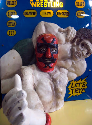
These photos were made at the Musee Mechanique in San Francisco. The first two are close-up shots looking into old arcade games. the third one is photos of an antique love tester game.


The photos used in this transfer were taken at the Palace of the Legion of Honor in San Francisco. It’s two separate photos transferred one a a time to make the finished image. I like this one a lot better than the larger Field Museum panoramic images I posted here.

Two more Polaroid lifts.


These were both shot at Fairyland in Oakland, CA. It’s a surreal amusement park for young children. I visited with my niece, as they won’t let adults unaccompanied by children to enter. I made negatives of both these lifts, and used them to make VanDyke brown prints. I’ll post those in a few days. Meanwhile, it's back to work figuring out gum bichromate printing.

Tuesday, December 4, 2007

Gum Bichromate Test Prints

I’ve been making test prints in the gum bichromate process for about a month, and while I seem to be making progress, there’s still a long way I have to go before I can start making real prints. As I mentioned in my last post, there are many more variables to test out with this process than there are with many other alternative printing processes. Fortunately, the more one works with the process, the easier it becomes to weed out unlikely causes to problems and focus on what needs to happen to correct a bad print. Even so, the process is more involved and time consuming than other processes I’ve been working with. Each color layer takes a day to coat, expose and dry, plus the paper needs to be preshrunk and sized. Each of the test prints you’ll see here involved at least five working days to make them.

What I’ve been working with so far in the gum process is mainly testing basic working methodology, exposure, and transfer curves. You might want to read this post from last September about making transfer curves for the cyanotype process. With gum bichromate printing, this issue is tripled, because I’m trying to print in three colors on the same image. This is on top of the other variables involved with learning a new process.

Here’s the quick version of what I’ve done so far. I’ve left out a lot of details and tried not to be too technical. Send me an e-mail or comment if you want more info.
I started by creating a test image file to use when printing gum bichromates. It includes overlapping color percentage scales for cyan, magenta and yellow, a color wheel, and a sample photo. Here’s the test image I made.


I opened this image in Photoshop, and made RGB separations. These separations I printed as negatives onto separate pieces of transparency film. The negative of the red channel is used to print the cyan gum layer, the negative of the green channel is used to print magenta cyan gum layer, and the negative of the blue channel is used to print the yellow gum layer, I decided to work in CMY, not CMYK, as I’m not concerned with accuracy in the color prints. I prefer the odd color shifts I’ll get. If I wanted accurate color, I’d just make an inkjet print of my image.

Here’s my first test print.


For this test, I tried something different that I read about online, and did a cyanotype print as my first layer (instead of a cyan gum print). The blue looks decent here. Unfortunately, the magenta and yellow are both really underexposed. None of the books or websites I’ve researched give recommended exposure times for gum prints. It’s one of those variables you have to work out for yourself.

Here’s my second test print.


Yellow and magenta exposures are looking much better here. It’s obvious I’ll need some adjustment to the transfer curve, but things are looking decent. The colors were bothering me, however. You can print gum bichromates using any color of watercolor paint mixed into the gum arabic solution. The yellow and cyan paints that came with the kit I bought didn’t seem to be working that well for me. So, I bought different colors and made a third test print.

Here’s test print number three.


The magenta and yellow layers have better color than I was getting with the previous paints. In fact they are so smooth looking here that I started doubting the wisdom of doing a cyanotype as my first layer. You can see in this print that the cyan layer is much grainier than the others, and it seems to be affecting the quality of the image. With this print, I also decided I didn’t like the paper I’ve been using for gum prints. Based on advice in a book,, I’d been using 300 lb. watercolor paper. That paper is really heavy and stiff, curls badly when it dries and has a texture so heavy that the image quality suffers.

On to test print number 4.


Two major changes were made. First, I actually made two identical prints this round, one on 300 lb paper, the other on the same 140 lb paper I’ve been using for cyanotype and VanDyke brown prints. The good news is that the 140 lb paper works perfectly fine.
The other big change is that I decided to eliminate doing a cyanotype as a first layer, and print all three layers as gum prints. The standard order is to print yellow first, magenta second, and cyan last, which is what I’ve done here.

Exposure is looking decent throughout, although the cyan layer is a little light. The bigger issue is that without the cyanotype as a first layer, the registration marks I put into the image file were completely covered by the magenta paint. I had to guess and improvise a registration method on the fly, and as a result, the layers are way out of registration. Based on this print, however, I was able to finally make adjustments to the transfer curve and print out new RGB negative separations.

Here's the first test print made with the new adjusted separations.


The good news here is that the magenta layer is just about perfect. I don’t think I could make it better if I tried. The bad news is that yellow and cyan are far from perfect. Because I’ve done so many of these already, it’s become much easier to figure out what I think needs to happen. Based on this test print, I think that yellow needs more exposure. Cyan, however is another story., It’s too pale and needs more watercolor paint in the gum arabic solution. I’ve been mixing at the rate of 1g paint to 5 ml gum arabic. For the next round, I’ll try cyan mixed at 1g paint to 3 ml gum.

On to test print number six. I don’t have a scan of it as it’s still in process. I exposed yellow first, at 4.5 minutes. It’s maybe slightly overexposed, but not by much. It looks pretty good. Today I printed the magenta layer, which based on the last test print,was as good as it will get. Unfortunately, the entire layer came off in the wash. I have no idea what went wrong. I did everything exactly as I did it last time, but something didn’t take. I looked up some info in books, but they say that a layer washing completely of is either the result of over-sized paper or underexposure. The size on the paper is exactly the same 1:4 gesso and water mix I’ve used all along, and the exposure was the same as well, so nether answer seems right. I’ll just have to try again.

Meanwhile, I’ve got a bunch of VanDyke brown and cyanotype prints waiting to be printed, and I recently finished several Polaroid lifts that I’ll post soon. The gum printing is starting to get frustrating, but I’m doing plenty of work oustide of that process.

Tuesday, November 27, 2007

Making Gum Bichromate Prints

Gum Bichromate printing is one of the more difficult alternative photographic printing techniques. The process itself isn’t the difficult part, it’s that there are endless variables which all need to be tested before you can get a useable print. As of this writing, I’ve made five test prints, adjusting the process each time, and I am still several tests away from making a real print using the process.

The process of gum bichromate printing is easy to understand. Gum Arabic is mixed with watercolor paint. This is in turn mixed with ammonium or potassium dichromate. Adding the dichromate causes the gum arabic to begin to harden. This hardening is proportional to exposure to ultraviolet light. So, if you take a mixture of gum arabic, watercolor paint, and a dichromate sensitizer, paint it onto a piece of paper, dry it, and contact print it, you end up with an image in whatever color of paint you used. A very brief discussion of the process can be found here.

Any color of watercolor paint will work for a gum print, but what many people choose to do is approximate a full-color image by creating CMYK or RGB negative separations and printing each one in the appropriate color. The results won’t have accurate color, but will be close enough to provide interesting results. Negative separations are easy to do in Photoshop, and can be printed on a good inkjet printer using good quality transparency film.

I’ll discuss the difficulties I’m having with creating transfer curves and other technical issues in my next post. For now, here’s some photos taken while I was making a gum print, which will give you an idea of how it works.


First, paper is cut, preshrunk in hot water, dried, and sized. After sizing the print is coated with a sensitizer solution. In this photo I’m adding a premixed gum arabic/paint mixture to a a solution of potassium dichromate to create the sensitizer.


The mixed solution is painted onto a piece of paper. You can see from the photo that I have already printed other color layers on this print.


After coating, a clean brush is used to smooth out the gum solution on the paper. This ensures a more even exposure. The sensitized paper is then dried.


The negative is put into exact registration with the existing image and taped into place. If it is even slightly out of registration the image will turn out blurry.


The print is placed into a printing frame and exposed to ultraviolet light. I made my own exposure unit which uses UV fluorescent bulbs and a commercially made printing frame.


After exposure, the print is soaked face down in a tray of water until it clears. This could take a few minutes, or several hours.

Each 3 color print takes at least five days to complete. First, cut sheets of paper need to be presoaked. Because the paper will be put into several water baths and allowed to dry between them, it has to be presoaked to allow the paper to shrink. Failure to do so will result in negatives that do not register correctly.
Secondly, the presoaked paper must be sized. There are several sizing methods available. I’m using gesso diluted 1:4 as a size, mainly because it’s quick and easy. It still has to dry overnight, however.
Once your paper is preshrunk and sized, each color layer takes a full day. Development can take hours, and the paper must be completely dry before adding the next layer. Given this, it’s easy to see how this process is taking weeks of testing. I’m still printing in other processes while doing gum prints, so I am getting plenty of wok made.

In m next post, I’ll show some test gum prints and discuss what is going well, and also not so well.