Thursday, December 17, 2009

Fuji Transfers


When Tom and Christie were married in September, Christie asked me to make Polaroid lifts of their wedding photos. It sounded like a great idea to me, except for one thing: Polaroid film is no longer being manufactured. I’d heard that Fuji instant film would work, but that the process was somewhat different than when using Polaroid film. So, I did some online research, and gave it a shot.

The basics are the same. If you’re using a Daylab (or in my case, a Vivitar slide printer I bought on Ebay), you need to start with slides. If you have a good quality flat screen monitor, it’s very easy. Load slide film into your camera, set it on auto, mount it to a tripod, open the images in Photoshop, hide all the menus, and shoot. The slides come out perfect. Based on my research, I over saturated the color on the photos a little before I shot slides of them, to compensate for a tendency of the transfers to look washed out.


The fuji film I used is FP-100C. It’s a color instant film the same size as Polaroid 669 film, and fits easily into the slide printer (Fuji also makes an instant black & white film, which I haven’t tried). Exposing the film was a little tricky. The Fuji film has a slightly different ISO than the Polaroid film, and the VIvitar slide printer has limited exposure adjustment. Try as I might, the prints all come out lacking details in the highlight areas, not a good thing when you’re making prints of a wedding dress. I actually think that the Fuji prints are high in contrast, as the dark areas of the prints also lost detail. The next time I try lifts with this film, I’ll try lowering the contrast of the images before shooting the slides to see if it improves things.

Aside from the contrast issue, the Fuji prints looked pretty good. The color balance is much better than the Polaroid 669 film, which always had a very distinct cyan cast (the Fuji black & white lifts show a cyan cast in the blacks, but I kind of like how it looks).


As for making the lifts, Fuji film is similar, but also quite different from Polaroid. FIrst, I found that warmer water to soak the prints in worked better. I did all my Polaroid lifts at 160 degrees F. Fuji film worked better around 180 degrees. The soak time was shorter, it took about 1-2 minutes in the hot water to loosen the emulsion on the Fuji film. After transferring the print to a tray of cool water, the emulsion easily slid off of the backing, with little fuss. That’s a big improvement over Polaroid film, which can be difficult to remove from the backing.

The Fuji emulsion has a very different feel from the Polaroid. It has an almost cellophane like crispness, unlike the mushy and easily damaged Polaroid emulsion. It can be handled quite a bit, something that would have left you with a tray of Polaroid soup. It’s a little less malleable than the Polaroid film, but not so much that you can’t get some good wrinkles and bends into the image. The one thing I really do not like about the Fuji film is that the edges of the emulsion tend to curl, and it can be very difficult to unroll it and get it to lie flat. Many of my lifts of the wedding photos have a distinct dark edge caused by this curling.

The reading I had done on Fuji lifts said that the Fuji emulsion would not stick to paper like Polaroid emulsion, and needed to be glued down. A couple of sources recommended picking up some of the ‘glue’ that held the emulsion to the backing, and spreading it on the receiving paper. I found this impossible. First off, there is no glue, it’s obviously gelatin. Secondly, the shorter soaking time means the gelatin does not dissolve. I found that coating the receiving paper with acrylic medium before transferring the emulsion to it worked much better.

Overall, I mostly liked the Fuji lifts. The color is a significant improvement over Polaroid 669 film, and the emulsion is easier to handle. I do wish it were a little more malleable, however, and the curling of the edges is really annoying. Maybe, if The Impossible Project decides to resurrect 669 film, they can solve the color issues, and we’ll have a great instant film for doing lifts.

Congratulations, Tom and Christie! I have 22 lifts from your wedding photos to give you when I see you next week.
Thursday, November 12, 2009

MVCC Faculty Exhibit

I have a piece in the annual faculty exhibit at Moraine Valley Community College. The show runs November 16 through December 17 in the DeCaprio Gallery in the Fine and Performing Arts Center at Moraine. The reception is on Thursday, Nov. 19, 2-4 p.m.

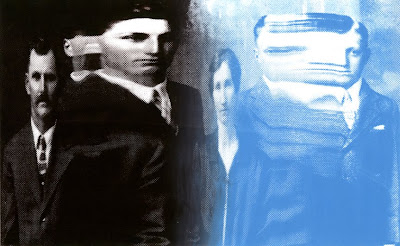
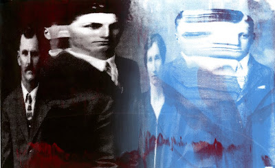
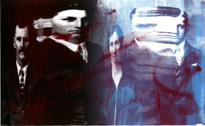
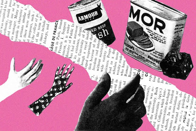
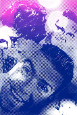
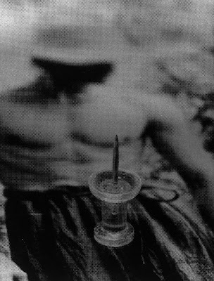
My piece is a diptych of silkscreen prints I made this past summer. I'll give you a sneak peak: It's the first two images in this post. I titled it Office Romance. Not the most serious work I've done, but I like it. It makes me laugh.

Sunday, September 13, 2009

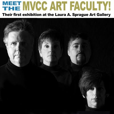
Meet The Faculty!


I'm going to be part of an exhibit, along with my colleagues in the MVCC Art Department, at Joliet Junior College in Joliet, IL. Show dates are Oct. 5-Oct. 30, 2009. If anyone will be in the Joliet area, stop in and take a look. I don't know when the reception will be, but I'll post it as soon as I know.
Friday, August 21, 2009

The Summer Of Screenprinting V

Here are the final prints I made as part of my summer silkscreen class. The last day of the class was used to demonstrate monoprinting and finish up prints in progress. I wasn’t really working on anything, so I printed a transparency of this image to expose onto a screen.


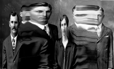
This is an old photograph placed on a scanner and moved while the scan was in process. I decided to print with a blend of two colors of inks, mainly to use up some custom mixed colors. I settled on brown and light blue.
Here’s a print made once the colors had started to blend together.


There was also some red ink, mixed with just a touch of metallic silver, that needed to be used up. I threw some on the screen and ran another print.


Some more red ink added, and a couple of prints pulled to bleed the colors, and this was the result:


This one I like. It’s kind of creepy, the red has a splattered blood look that makes the portraits look ominous.

While making these prints, I had first printed onto a piece of mylar to help with registering the paper under the screen. I forgot to move the mylar with the wet ink while pulling a print onto a piece of scrap newsprint, and found afterwards that the ink from the mylar had transferred to the paper. Here’s the result:


I really like this. I find the wrinkles and visual noise appealing, and I can see myself exploring this idea further in the future. I love happy accidents!

So, that’s it for screenprinting, at least for now. I’ve just set up a screenprinting lab in my basement, and am currently running exposure tests and troubleshooting. Getting exposure times right is kicking my butt a little, but I hope get it worked out and start making more prints soon.

Thursday, August 13, 2009

The Summer Of Screenprints IV

Here are a couple more prints from my recent foray into silkscreening.Both of these prints are remakes of pieces from my Postcard project from last summer. You can click the link for more details, but in a nutshell, these are reworked postcard sized collages from twenty years ago. I'll start with the original, a simple black and white photocopy of the collage made in 1988.

From Lightbender

Here's the digital reworking of the collage I did last summer:

From Lightbender

And finally, here's that reworked collage translated into a two-color screenprint:


While there may not seem to be much difference between this and the digital version, when viewing these in person the difference is immediately noticeable. The screenprint has a tactile quality that isn't present in the digital print, and the pink background is much brighter (I mixed white with a florescent pink ink to get that color).

Here's another of the old postcard collages remade. First, the photocopy of the original collage.


Next, my rework of the original from last summer.

From Lightbender

Finally, here is my revised collage done as a screenprint:


I like this quite a bit. I used two inks, pink and purple, and screened them together. It looks great, I like the colors, and the halftone pattern works really well with this image. I plan on experimenting with putting a gloss coat of a 50's inspired pattern over this, but haven't come up with anything I like yet.

Making these screenprints has rekindled my interest in these old collages once again. They seem to somehow make sense as screenprints. I'm in the process of setting up a silkscreening lab in my basement, I wouldn't be surprised if more of these postcards end up as my first prints once the lab is ready to go.

Wednesday, August 12, 2009

The Summer Of Screenprints III

This is the third post in a series looking at my recent attempts at screenprinting. By now, I’m getting used to the process of silkscreening, and starting to think more about what can be done with it. These prints are some of the favorite ones I’ve made as part of my lessons.

The first two are admittedly kind of puerile, but I can’t help but like them. They make me laugh. They started as photos I took when playing around in my studio, which I often do when I’m between projects and looking for inspiration. I had been shooting photos of small toys placed on magazine pages, then switched to office supplies.


It doesn’t show up much in these photos, but the silkscreen prints are done on black ink against a background of metallic silver ink. The black on silver looks really great, and really makes the images pop.

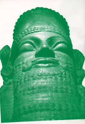
This next bunch of prints were made from a photograph of a huge statue of a Mesopotamian human-headed winged bull in the Oriental Institute at the University of Chicago.
The first one is printed with green ink on a piece of newsprint.


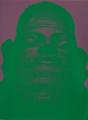
The next one is also green ink, but with a mauve background. I did this for fun, and ended up liking the psychedelic feel of the print. The figure isn’t particularly easy to see, but it’s a fun print.


Here’s a third version of the same image. This one is a color blend done by placing blue and yellow ink together on the screen. Several prints are run, the ink becoming more blended with each consecutive print until a gradient results. This is one of the earlier prints in the run, and the colors are sill pretty separated. The newsprint this is printed on had a rectangle of metallic silver ink on it (left over from printing the images at the top of the post) which I thought looked pretty good with this photo screened onto it.


I still have several prints to post, look for more over the next couple of days.

Monday, August 10, 2009

The Summer Of Screenprints II

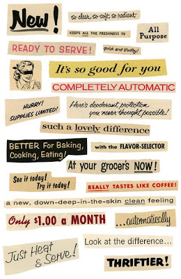
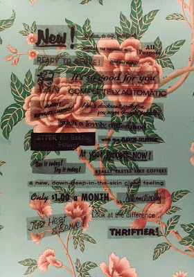
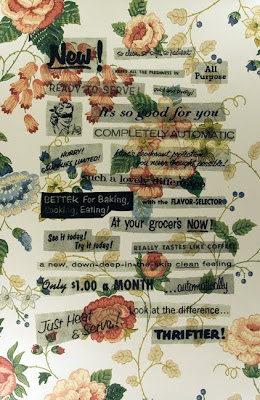
Here’s a few more screenprints made as part of my silkscreening lessons. I made a collage of text from 1950’s homemaker’s magazines, and silkscreened it onto wallpaper. These were done using the photo emulsion silkscreening method, which basically involves coating the screen with a light sensitive emulsion, and exposing an image onto it. The printable areas are washed out, leaving a sort of stencil on the screen for making prints.
Here’s the original collage:


and here are several versions of it silkscreened on to various pieces of wallpaper.


I went through some old wallpaper sample books in my studio and chose pieces that I thought would work well with the text. I decided to print with just black ink, because as a beginner, I wanted to keep it easy. I may go back and reprint this while making some of the text red.


The last one is my favorite. It looks much better in person, the photo I took of it looks pretty crappy by comparison.
I'll post more screenprints soon.

Sunday, August 9, 2009

The Summer Of Screenprints

As I mentioned here a couple of posts ago, I’ve been taking lessons in screenprinting. The printmaking instructor at the school where I teach has been giving me lessons in her basement studio. I’ve learned quite a bit in a short period of time, and while I still have more to learn, I’ve been happy with what I’ve been doing so far.

I’m not going to go into a lot of detail about the silkscreening process, but I’ll share images and discuss them a little.

This is the first real print I made. It uses the drawing-fluid method of screenprinting. I was interested in printing over a background image, so I made a 50’s inspired design that had a lot of space. Not the best piece I’ve ever made, but it served it’s purpose. Here’s a test print on newsprint, without an image behind it:


You’ll notice it didn’t print real well-it’s uneven on the left side and along the top. This was a 13 X 18 inch print, and the screen I was using was 16 X 20. What I didn’t know at the time is that you should leave a larger border on the screen around the image you are trying to print. I kind of like the way this looks, however. The flaws in printing add visual interest.

Here’s a few more versions of this print. I printed 13 X 18 inch photos on my inkjet printer, and silkscreened the image on top of them.


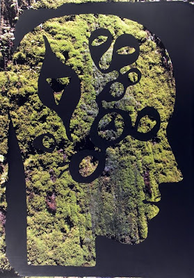
This was printed on top of a photo of moss I took while on vacation last month. I like this one quite a bit.

This is printed onto a black and white photo of grass. It’s ok, but I like the other ones better.


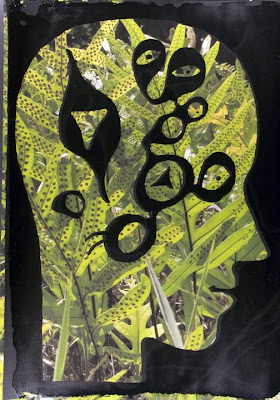
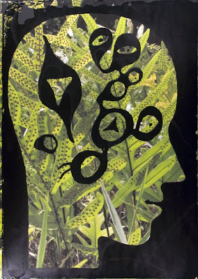
This one is printed onto a photo of ferns I took when in Hawaii a couple of years ago.


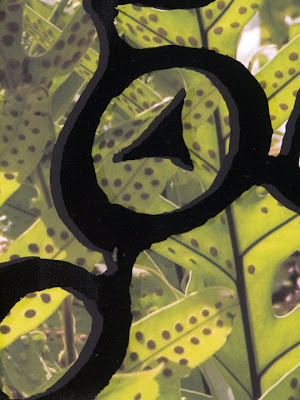
I added a clear gloss coat over the black, which as you can see in the close up, was out of registration.

I made a second version on the same photo, and on this one, the gloss coat is better registered. It’s my favorite of these prints.


I’ve got several more prints to share, I’ll post more over the next few days.

Saturday, August 1, 2009

F-Stop Magazine

The new issue of F-Stop Magazine is now online. They published two of my photos. To see them, click on the link, then on the group exhibit (titled 'Amusements'). My photos are in the bottom row, on the right hand side.
While you're there, take a look at the work by other photographers. There's some good work there.

Monday, July 27, 2009

Good News!


Today I received the following e-mail:

"Just a quick note to let you know, one or more of your images will be
included in the upcoming issue of F-Stop Magazine.
Thanks for contributing!"

F-Stop is a well done online photography magazine. I submitted some nighttime shots of a fair, and apparently they liked them. I'll post again once the issue with my photos goes online.

Still Working, Really!


As I wrote in my last post (was it really a month ago?) I am putting in some studio time this summer, but at a pretty slow rate. I was on vacation for a couple of weeks earlier this month, which I enjoyed greatly, although it kept me away from the studio. Now, I'm taking some lessons in screenprinting (which I somehow missed during my years in school), and hope to have something decent enough to post here soon. I've only made a couple of prints so far, but have more lessons Monday and Tuesday.


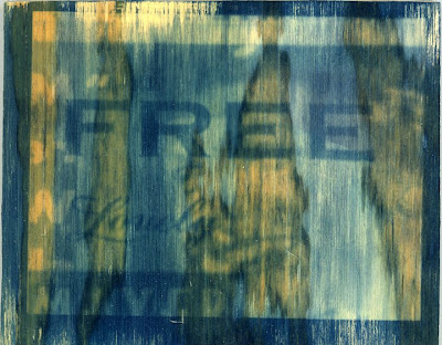
Meanwhile, here's a couple of small Van Dyke brown prints I made around the same time as the cyanotype on plywood experiments I posted about previously. These are vintage photographs that I scanned while dragging and sliding the prints around on the surface of the scanner. I made these scans over Spring break this year, while basically goofing around in my studio. I really wasn't planning on doing anything with these, but ended up liking some of them.


The photos came from two sources. One is a box of old photo portraits which has been sitting in a cabinet in the photo labs where I teach for as long as I've been working there (I'll be starting my ninth year this fall). I have no idea where they came from, and no one has ever expressed any interest in them, so I brought them home last year to keep them from getting ruined by splashing chemistry, and to do something creative with them.

The other source is more interesting. About a year ago, I bought a copy of the book LaPorte, Indiana. It was written by one of the people behind the wonderful Found Magazine. The book consists entirely of studio portraits dating from the 50's-70's from a portrait studio in LaPorte, IN. The book details finding dozens of boxes of these portraits in a diner in LaPorte, which now occupies the storefront formerly occupied by the photo studio. I was in LaPorte last fall doing volunteer work for Barack Obama's presidential campaign, and made it a point to stop at that same diner. Sure enough, they still have dozens of boxes of old portraits, which they sell for 50 cents apiece. I bought a couple dozen of them.


These were meant to be test prints, just to test the negatives. My original goal was to try to print onto gold leaf, but my attempts were such a dismal failure that they went directly into the trash. I have a couple ideas to try along those lines, but haven't had time to follow through. I don't know if I'll stick with these images (Van Dyke brown on plywood could be interesting), but they might fit well with other ideas I'm exploring right now.

Thursday, June 25, 2009

Recent Experiments

I’ve been having a relaxing summer, and probably not putting in as much studio time as I should be. I am working on a couple of different things, mainly trying to print alternative process photos on different surfaces. Not a lot of success yet, as you’ll see, but I’ve got more things to try.

Recently, I’ve been working at making cyanotype prints on pieces of plywood. I swear I’ve seen that done before, but can’t seem to find any examples in any of my books on alternative processes.

Here’s one of the images I’m working with, printed on paper. While it needs a little work, I can get a decent print fom the negative I printed. The image, by the way, is something I shot a couple of years ago. I have a bunch of old magazines from the 50’s in my studio, and this part of a page from one of them shot on a light table, so that the images on both sides of the page show.


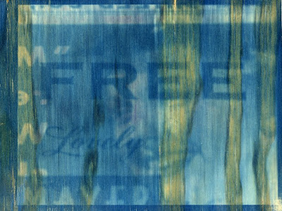
For my first attempt attempt at cyanotype printing on plywood, I just coated the wood, let it dry (it seemed to take a long time to dry, similar to coating fabric for printing), and exposed the negative. As you can see below, it didn’t work out so well.


It looks a little underexposed (again, like printing on fabric, which I’ve found takes longer to expose than paper). It’s also difficult to read the image. Part of that is from is the roughness of the wood, so I sanded a piece, coated it (the sanded piece dried more quickly) and exposed it. I increased exposure by a couple of minutes as well.


This one came out better than the first one, but still not that great. While it’s easier to see the image here than on the first one I did, it’s nowhere close to where I want it. I’m going to try sizing the wood next, probably with gelatin. I’ll let you know how it turns out.

Wednesday, June 10, 2009

Vacation Photos


I’ve got at least three different ideas I’m (kind of) working on right now, and will post some of them here once they’ve progressed to a point where it makes sense to show them.

In the meantime, here’s some pieces from a small project I just completed. I was asked (in a semi-joking way) to hang vacation photos in the showcases in the Fine and Performing Arts Center of Moraine Valley Community College, where I teach. I agreed, then had to come up with something interesting, so that the cases weren’t filled with a bunch of boring photos.
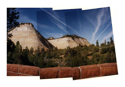
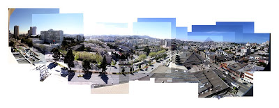
I decided to enlarge some panoramic or joined photo pieces, and print them on several pieces of 13 X 19 inch paper, and surround them with more typical scenic photos.

I’ve played with these ‘panoramas’ for several years, shooting them while on vacation, and sometimes close to home as well. I always do them quickly, and while I try to line things up, I don’t aim for perfection. I like the spatial distortions that occur, as well as the changes in exposure in the different individual photos that make up a panoramic image. The one at the top of this post was taken at Zion National Park in Utah in 2001. That one was shot using a film camera. The individual prints were pieced together then scanned.


This one was shot in The Netherlands in 2005. I like how the blades of the windmill are not lined up in the various shots that make this piece. The movement of the blades becomes evident as a result.


I shot this from the 15th floor balcony of a hotel room in San Francisco's Japantown in 2003. The overlapping photos seem to increase the busyness of the urban scene.

These vacation photos, along with several non panoramic shots, are currently on display in the showcases in the atrium of the Fine and Performing Arts Center of Moraine Valley Community College in Palos Hills, IL. They should remain up for most of the summer.

Thursday, April 30, 2009

Happy Anniversary!


Today is the second anniversary of this blog. My first post here was April 30, 2007.

I started this blog mainly to document a sabbatical I took during Fall semester, 2007. My school requires a fairly detailed post-sabbatical report, and I figured that a blog would serve that purpose well (which it did. My post report consisted mainly of a printout of the entire blog, which is why my personnel file in the Human Resources office fills two thick file folders).

After returning to work, I kept the blog running, mainly as a way to show new work as I made it, to share work in progress, and discuss art in general. I've done that, but have posted less frequently in recent months. There's a couple of reasons for that. One, I usually spend much less time in the studio during the school year than I do over the summer. Two, while I have a lot of ideas in my head, I haven't been making too much of them. School lets out soon, and I'm hoping to jump right into the studio (and yard work, riding my bike, cleaning the house, and all the other things that get ignored when I'm teaching).

I've also kind of forgotten about posting work by other artists that I like here. I really want to pick that up again (artists and art lovers: Send me links!).

So there we have it. I like the blog, and plan on keeping it running. If I get ambitious, I'll actually post here more than once a month. While waiting for posts here, you can always check out A Photo A Day, my other blog (which had it's one-year anniversary yesterday). There, you'll find a new photo nearly every day, along with a few comments about it.

One last thing: The image at the top of this post was something I found stapled to a telephone pole in Ann Arbor, MI, sometime in the late '80's. I've always thought it funny. I have no idea why it was there, or what the original source was.

Tuesday, April 28, 2009

Expiration Notice

I just had a piece published in Expiration Notice, a new photo blog for photographers over the age of 35 who are making good work but aren't famous.

Unfortunately, it looks like the blog will be going away for a while. They are taking the summer off, while looking for some sort of sponsorship. They say they will publish again in the fall. I hope they do, I like the idea a lot. I have nothing against younger artists, but it can be frustrating seeing so many opportunities that limit the age of who is eligible.

Friday, March 13, 2009

From The Archives III


I’m nearing the end of spring break, which has been quite productive. I’ve worked a great deal in my studio this past week, and have a lot of work in progress (and a lot of thinking to do). I don’t have anything ready to post here, however, so it’s a good time for the third installment of From the Archives, wherein I post an old piece of work and write some comments about how it was made and what I was thinking about (you can read the first installment here, and the second installment here).

Doppler #1 was made in the summer of 1997, after finishing my first year of graduate school. Nearly all of the work I made my first year at Cranbrook reflected an interest in scientific structure and notation. After school let out, I was determined to continue the momentum in my studio practice and work throughout the summer (which was the first time since 1981 when I didn’t have a job over the summer). Carrying the ideas of structure and notation into the work I made over that summer, Doppler #1 was an attempt to visually recreate and diagram Doppler effect (changes in pitch of a moving object's sound). In this piece, the photographic fragments, the objects in the photographs, and the spaces between the strips of photographs get wider as they move from left to right across the composition. References to motion and sound occur throughout the photographs used to create this piece. Here’s a close-up (excuse the fuzziness, it’s a scan of an old slide, and I couldn’t get it to turn out well).


I shot the photos on a warm summer evening. I had my partner Kevin put on dress clothes, and I shot him playing his violin near a freeway overpass in a semi-wooded area close to where we were living in Ann Arbor. I waited until large trucks or other vehicles were on the overpass, as I wanted to emphasize motion and feature things that produced sound in the photos.

After processing the film, I scanned the negatives, and manipulated them in Photoshop by stretching and squashing the images. These manipulated images were taken to a digital imaging lab, where they were printed onto pieces of photographic film. I used this film to make the prints. There are three 20” X 24” photographs in this piece, all printed in a traditional wet darkroom on photographic paper. These prints were cut into strips and reassembled onto a large sheet of heavy paper (approx. 36” X 80”).

Doppler #1, along with a second doppler piece (with the unimaginative title Doppler #2), are the culmination of my lengthy exploration of scientific structure and notation. Upon finishing the two doppler pieces, I felt I that this direction for my work had run it’s course. I returned to school in the fall of 1997 determined to work in a different direction. Which I did, after a couple of false starts. I don’t think I did much with these pieces. I’ve never exhibited them anywhere, and I don’t remember ever critiquing them a Cranbrook. I liked them at the time, but they were lost in the shuffle of wanting to do something different with my work. Now, they’re in a closet in my studio.

Friday, February 20, 2009

Update


I found this today and thought it fit well with my last post. It's a time lapse video of tourists on Abbey Road in London posing like the cover of the Beatles album.

Wednesday, February 18, 2009

Original Ideas?


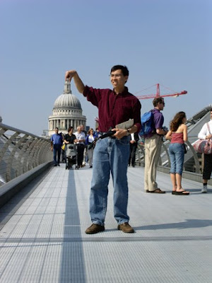
I shot this photo in London in 2003 (you can read the details here). This sort of shot isn’t unusual, and it isn’t difficult. It’s done quite often. As ideas go, it’s not the most original one, even if it is fun.

The other day, I found this photo on a blog I read:


I like this quite a bit. Instead of shooting someone holding up the Tower of Pisa, the photographer (who wasn’t credited on the blog) shot people posing for other photographers who were taking the ‘holding up the tower’ shot. The first time I looked at this, I thought it funny and original. The second tilme I looked at it, I thought it looked a lot like the work of Martin Parr. It looked so much like Parr’s work that I did a Google image search for ‘Martin Parr Pisa’. What I found is that the photo isn’t Martin Parr’s. He did do a photo very similar to that, however. You can see it here, along with a short discussion on his work.

Of course, that same Google image search turned up several other examples of people ‘doing a Martin Parr’, and shooting people in a similar manner as in Parr’s photo (you can see several interesting ones by the same photographer here). Parr has, in fact, done an entire book of photos of this sort, titled Small World. I haven’t seen it, but it’s probably great. Most of his work is.

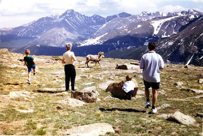
Turns out, I’ve done this type of shot as well. This was shot in 1999, in Rocky Mountain National Park:


Above the treeline in the Rockies, the grasses and mosses grow at an extremely slow rate. Walking on them can cause irreparable damage. Signs are posted everywhere warning people to stay on the paths and to avoid any wildlife. These tourists selfishly ignoring those signs and trodding on the delicate grasses while chasing after the wildlife made an interesting, if annoying photo.

Looking at and thinking about these photos raises a question. When a subversion of a typical tourist photo itself becomes typical, do we accept the seeming scarcity of originality, or merely chalk it up to independently occurring ideas? Or, do we look for the next way to be subversive, even though we know that someone else is probably thinking the same thing?

Sunday, January 18, 2009

New Polaroid Pieces


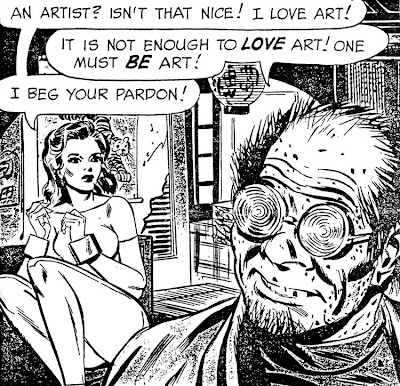
I returned to teaching this week after a semester break that was shorter than usual (and felt like it). While on break, I kept busy by making some Polaroid lifts and transfers. I tried something different with these. I took clippings from various magazines and comic books, stuck them in a slide mount, and used these as the slides I made my Polaroid prints from. I must admit that’s not my original idea. An independent study student of mine was doing the same thing last year while learning how to do Polaroid processes. I will say, however, that I’ve done a pretty similar thing for years. When I’m between projects, I take old magazines and comics, throw them on a light table, and photograph what I see. Here’s a page from a magazine I shot back in 2005.


While making these manipulated Polaroid prints, I tried doing both lifts and transfers with the same images. Here’s a Polaroid lift:

and here’s the same image done as a Polaroid transfer:


I expected the differences in the surface between the two pieces. What I wasn’t anticipating was the difference in color between them.

Here’s another lift:


and the same image done as a transfer:


Again, there’s a big difference in color between the two.
I think I know why this occurs. Polaroid lifts start with a fully developed Polaroid print. The photographic emulsion is removed from it’s original backing, and placed onto a new surface. Because the print is fully developed, the color is pretty accurate (for a Polaroid, that is. Polaroid prints aren’t known for having good color).

Polaroid transfers, on the other hand, are made from the negative half of a peel apart Polaroid print. The negative is peeled before the print fully develops. Because the color layers of the film transfer one at a time, depending on how long you wait before pulling the negative off, some of the color layers may have transferred to the print surface, and therefore won’t show up in the transfer.

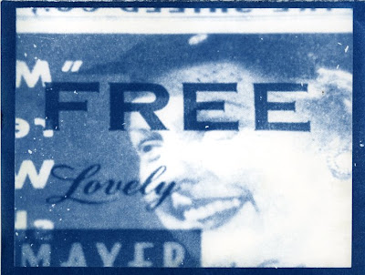
Here’s one more set of prints. The Polaroid lift is first, followed by the transfer.


While this was fun and kept me busy for a few days, I’m a little ambivalent about the results. I like them, but I’m not sure how much I like them. I made about fifteen prints total, and I’m not sure if I’ll be doing any more like this. My favorite is the Polaroid lift you see above of the face with text on it. I’m considering trying a gum bichromate print of that image. If that turns out, I might make more of these (provided I can get Polaroid film, which just stopped being manufactured).