Tuesday, November 27, 2007

Making Gum Bichromate Prints

Gum Bichromate printing is one of the more difficult alternative photographic printing techniques. The process itself isn’t the difficult part, it’s that there are endless variables which all need to be tested before you can get a useable print. As of this writing, I’ve made five test prints, adjusting the process each time, and I am still several tests away from making a real print using the process.

The process of gum bichromate printing is easy to understand. Gum Arabic is mixed with watercolor paint. This is in turn mixed with ammonium or potassium dichromate. Adding the dichromate causes the gum arabic to begin to harden. This hardening is proportional to exposure to ultraviolet light. So, if you take a mixture of gum arabic, watercolor paint, and a dichromate sensitizer, paint it onto a piece of paper, dry it, and contact print it, you end up with an image in whatever color of paint you used. A very brief discussion of the process can be found here.

Any color of watercolor paint will work for a gum print, but what many people choose to do is approximate a full-color image by creating CMYK or RGB negative separations and printing each one in the appropriate color. The results won’t have accurate color, but will be close enough to provide interesting results. Negative separations are easy to do in Photoshop, and can be printed on a good inkjet printer using good quality transparency film.

I’ll discuss the difficulties I’m having with creating transfer curves and other technical issues in my next post. For now, here’s some photos taken while I was making a gum print, which will give you an idea of how it works.
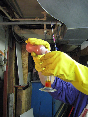

First, paper is cut, preshrunk in hot water, dried, and sized. After sizing the print is coated with a sensitizer solution. In this photo I’m adding a premixed gum arabic/paint mixture to a a solution of potassium dichromate to create the sensitizer.
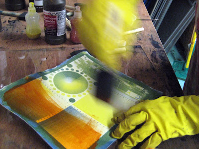


The mixed solution is painted onto a piece of paper. You can see from the photo that I have already printed other color layers on this print.
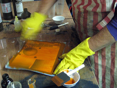


After coating, a clean brush is used to smooth out the gum solution on the paper. This ensures a more even exposure. The sensitized paper is then dried.


The negative is put into exact registration with the existing image and taped into place. If it is even slightly out of registration the image will turn out blurry.


The print is placed into a printing frame and exposed to ultraviolet light. I made my own exposure unit which uses UV fluorescent bulbs and a commercially made printing frame.


After exposure, the print is soaked face down in a tray of water until it clears. This could take a few minutes, or several hours.

Each 3 color print takes at least five days to complete. First, cut sheets of paper need to be presoaked. Because the paper will be put into several water baths and allowed to dry between them, it has to be presoaked to allow the paper to shrink. Failure to do so will result in negatives that do not register correctly.
Secondly, the presoaked paper must be sized. There are several sizing methods available. I’m using gesso diluted 1:4 as a size, mainly because it’s quick and easy. It still has to dry overnight, however.
Once your paper is preshrunk and sized, each color layer takes a full day. Development can take hours, and the paper must be completely dry before adding the next layer. Given this, it’s easy to see how this process is taking weeks of testing. I’m still printing in other processes while doing gum prints, so I am getting plenty of wok made.

In m next post, I’ll show some test gum prints and discuss what is going well, and also not so well.
Thursday, November 15, 2007

Some Recent Work


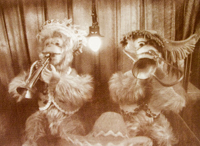
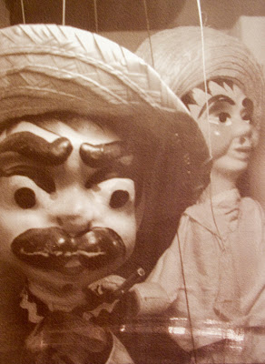
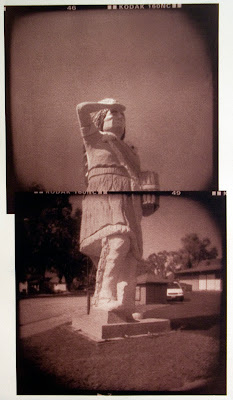
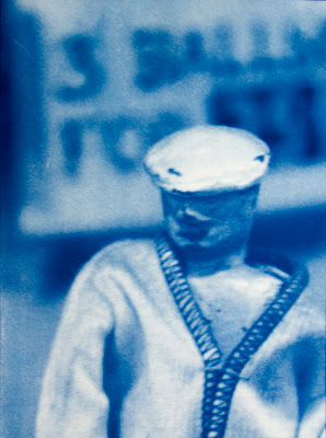
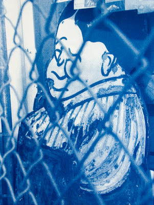
Here’s some recent work. These images were all shot at the
Musee Mecanique, which I visited when I was in San Francisco last month. I’m thinking of doing some sort of large grouping of prints made from images I shot there, but that hasn’t gone past the ‘thinking about it’ stage yet.


As always, I’ve been working in the studio, keeping busy with beginning gum bichromate prints. I’m trying to calibrate, adjust transfer curves, and determine exposure for three different colors, which is proving to be very time consuming. I should be able to post my first results soon, even if I’m not quite ready to make my first real prints yet.


Meanwhile, I’ve been doing lots of printing in cyanotype and Van Dyke brown, and am about to start some more Polaroid lifts and maybe Polaroid transfers. I haven’t worked with Polaroid since this past summer, so it will be fun to return to it.


Saturday, November 10, 2007

Double Printing and Toners

Still working a lot, very busy in the studio. I’ve just started some gum bichromate printing, but the first results aren’t worth discussing, so I’ll save it for another post. I’ve made several Van Dyke brown and cyanotype prints over the past week, and I’ll post some of those in a few days.

I read in a book that you can achieve a dark gray tone by printing a Van Dyke brown image on top of an underexposed cyanotype. You have to do the cyanotype first-if you do the Van Dyke brown as the first layer, the cyanotype sensitizer will bleach away the Van Dyke brown image.
I decided to try it. The first thing I did was presoak the paper I was going to print on. Papers, even the high quality ones I’ve been using, will shrink a little once they’ve been wet and allowed to dry. The image of course shrinks as well, meaning that when you go to print the second layer, you will not be able to achieve proper registration.

I used the negative I made for the first image in the last post, and did a cyanotype print at a 6 minute exposure, rather than the usual 12 minutes. When the cyanotype dried, I coated Van Dyke brown over it, and did a full exposure. Here’s what I got.


As you can see, I didn’t get the dark gray tones. It’s kind of interesting, but not what I expected.

I tried another one. This time, I used this print, Which I thought had printed a little splotchy. The cyanotype was printed at full exposure, and I hadn’t preshrunk the paper, so I knew the negative registration would be little off. What I didn’t expect was this.


The resulting image has a strong split toned look. Dark areas remain solidly blue, while lighter tones have a gray-brown color. The registration is of course off, giving a slight bas-relief look. There are also what look like brush strokes all over the print, which I’m guessing are from the application of Van Dyke brown sensitizer. I have to admit it’s pretty cool, and I like the look of the piece, even if I’m not going to exhibit it.

Looking back at the first print I made like this, I can now see the same split-toned effect. That image isn’t nearly as crisp or high contrast as the McDonalds panorama, so the colors seem to combine more.
While interesting, I don’t plan on continuing with combining these two processes. The unpredictability is appealing, but I want to focus more on gum bichromate printing, which will take a lot of time and energy to work out.

I’ve also played a bit more with toning cyanotype prints, which I previously wrote about here. I mixed up a new batch of tannic acid, and toned some old test prints. Nothing to great to report. Results were a little better than the last time I tried it, but still not terribly thrilling.
I did get one really good toned print.


The original, untoned cyanotype can be seen here. I soaked the print in sodium carbonate first, but either pulled it out too soon, or the chemistry had gone bad, as I didn’t see too much change. I stuck it in the tannic acid, and not much happened. So, I stuck the print into some highly diluted Dektol developer, then back into the tannic acid. The result is the deep violet with grayish highlights you se here. I love it, it works really well with that image.

Thursday, November 1, 2007

Recent Work

Nothing too new or exciting to report. I’ve been really busy in the studio, and have several pieces completed. I don’t necessarily like all of them, but that’s another story. Some of them I do like quite a bit, however.

I’m about to start working with the gum bichromate process. I’ve been procrastinating starting it, one, because there are several other process I’m still exploring, and two, because by all accounts it’s kind of a pain in the butt. I’ve done plenty of reading, and know I can make a good go of it, so the plan is to start making my first calibration prints as soon as this weekend. I’ll write more about how that works once I get started.

I think I may have an answer to the crappy results I was getting with the cyanotype toners I wrote about in the last post. In all three toners, the bleaching part of the process worked fine. It was only when I had to soak the prints in a tannic acid solution that they didn’t turn out right. The obvious answer is that the tannic acid solution was spent, so when I get time I’m going to mx some more up and try again. If anyone reading this has experience toning cyanotypes, let me know if you think I’m on the right track.

The plumbing problems I mentioned previously are also being resolved. I bought two new utility sinks at Home Depot that are larger than the ones currently in the basement, and the plumbers are coming tomorrow to install them. It’s going to be pretty expensive-the former owner of my house (who did home repairs as cheaply and stupidly as possible) had used pvc pipe for all the plumbing around the utility sinks, and it all needs to be ripped out and replaced with copper tubing. The plumber told me it should take several hours to complete. So, lots of labor charges and no printing tomorrow. That’s fine. There’s plenty of work I can do on the computer, and the plumbing really needs to be done.

In other news, the Beverly Arts Center, a local arts center in my neighborhood, has the opening reception for it’s annual juried art competition tomorrow night. I entered a piece which I made last year. It was accepted into the exhibit, but the big news is that I got a call from the arts center yesterday. They wanted to be sure I was attending the opening reception, because I won one of the awards being given. I’ll post more details when I know them.

OK, enough news. Here’s some recent work:


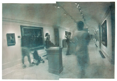
This one was taken in the National Portrait Gallery in Washington, DC back in August. It’s two separate photos collaged together. I like the blurred, moving figures, and the odd space/time shift that occurs by having the same woman appear twice. It’s a little streaky, I’ve been having difficulty getting the Van Dyke brown solution to coat well on Rives BFK paper. I printed this image a second time on Arches cold press, and it’s much clearer, although a little lighter and lower in contrast.


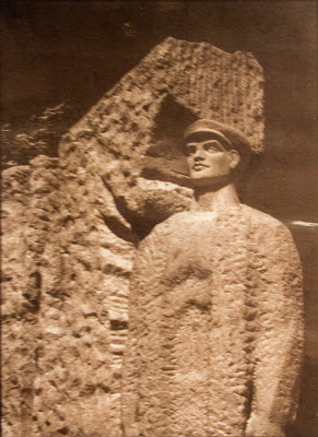
These photos were both shot in the Communist Sculpture ark in Budapest, and were printed in Van Dyke brown on Rives BFK paper. I like the first one quite a bit. The second one, not so much. The paper coated with streaks, and I haven’t reprinted because I decided that the image isn’t that interesting.


I really like this print. It’s a collage made from four closeup photos of a small (approx. 6” tall) acupuncture head model. I shot the photos through a store window in San Francisco’s Chinatown and enlarged them to get this print, which is approx. 13’ X 19”.


You’ve seen this one before, I posted the original cyanotype print about a month ago. This is the same print, toned using the eggplant black toner I wrote about here. Unlike my other attempts at toning cyanotypes, this one came out well, and I like the result.